1. 소개
이 섹션은 규범적이지 않습니다.
transform 속성과 관련 속성들은 box가 임의로 재배치(그리고 회전, 크기조절 등)될 수 있도록 허용하며, 원래 배치된 위치를 기준으로 다른 요소의 레이아웃을 방해하지 않습니다. 이러한 위치들은 CSS로 애니메이션하거나 트랜지션할 수 있지만, 상대적으로 단순한 방식(즉, 박스를 시작 위치에서 끝 위치까지 직선으로 이동)만 가능합니다.
이 명세는 offset 축약형과 관련된 여러 개별 속성을 도입합니다. 이 속성들은 offset transform을 정의합니다: 즉, 요소의 특정 지점(offset-anchor)을 경로상의 offset position과 맞추는 변환(offset-path 및 offset-distance)이며, 필요에 따라 경로 방향에 맞춰 회전(offset-rotate)시킬 수도 있습니다.
이를 통해 극좌표(ray() 함수)를 이용한 배치 등 다양한 새로운 변환 방식이 가능해집니다. 기존의 translate() 함수에서 사용하는 직교 좌표 대신, 요소를 정의된 경로를 따라 애니메이션할 수 있어 복잡하고 아름다운 2D 공간 전환을 쉽게 구현할 수 있습니다.

비행기가 offset-distance 값 0%, 50%, 100%에서 각각 표시되어 있습니다.
1.1. 모듈 상호작용
이 명세는 요소에 적용할 수 있는 추가적인 변환 타입들을 정의합니다 ([css-transforms-1] 참조).
CSS Transforms 2 § 6 현재 변환 행렬에 설명된 대로, 이 문서에서 정의된 변환은 개별 변환 속성 (translate/rotate/scale, [css-transforms-2]에서 정의) 이후, transform 속성 ([css-transforms-1]에서 정의) 전에 계층화됩니다.
1.2. 값
이 명세는 CSS 속성 정의 관례를 따릅니다 ([CSS21]). <basic-shape> 타입은 CSS Shapes Module Level 1 [CSS-SHAPES]에서 정의됩니다. <coord-box> 타입은 CSS Box Model Module Level 3 [CSS-BOX-3]에서 정의됩니다. 여기에 정의되지 않은 값 타입들은 CSS Values and Units Module Level 3 [CSS3VAL]에서 정의됩니다.
각 속성 정의에 나열된 값 외에도, 본 명세에서 정의된 모든 속성은 initial 및 inherit 같은 CSS 전역 키워드를 값으로 허용합니다 ([CSS3VAL]). 가독성을 위해 명시적으로 반복하지 않았습니다.
2. 모션 경로
2.1. 경로 정의: offset-path 속성
| 이름: | offset-path |
|---|---|
| 값: | none | <offset-path> || <coord-box> |
| 초기값: | none |
| 적용 대상: | 변환 가능한 요소(transformable elements) |
| 상속 여부: | no |
| 백분율: | n/a |
| 계산된 값: | 명시된 대로(as specified) |
| 정식 순서: | 문법에 따름(per grammar) |
| 애니메이션 타입: | 계산된 값 기준(by computed value) |
| 미디어: | visual |
offset path란 박스가 배치되는 기하학적 경로를 명시합니다.
<offset-path> = <ray()> | <url> | <basic-shape>
값의 의미는 다음과 같습니다:
- none
-
요소는 offset transform을 갖지 않습니다.
- <offset-path> || <coord-box>
-
요소는 offset transform을 가지며, 이는 offset path에 의해 정의됩니다. offset transform 계산에 대한 자세한 내용은 § 2.7 오프셋 변환 계산을 참조하세요.
transform을 가진 경우와 동일한 효과가 적용됩니다 (예: stacking context 생성 등). 자세한 내용은 CSS Transforms 1 § 3 변환 렌더링 모델을 참조하세요.
<offset-path>가 생략되면, 기본값은 inset(0 round X)이며, X는 이 요소의 border-radius 값입니다. 이때 containing block을 설정하는 요소 기준입니다. <coord-box>가 생략되면, 기본값은 border-box입니다.
각 구성 요소의 해석에 대한 자세한 내용은 아래의 특정 값을 참고하세요.
- <ray()>
-
offset path는 origin에서 특정 각도로 뻗는 선입니다. 자세한 내용은 § 2.1.1 ray() 함수를 참조하세요.
<coord-box>는 ray의 reference box를 제공합니다.
- <url>
-
SVG shape element에 대한 URL 참조입니다. offset path는 참조된 요소의 equivalent path가 됩니다. [SVG2]
만약 URL이 shape element를 참조하지 않거나(다른 요소, 비SVG 문서, 미해결 등), 대신 path("m 0 0") (<basic-shape>)처럼 동작합니다.
<coord-box>는 shape element의 뷰포트 및 사용자 좌표계를 정의합니다. 원점(0,0)은 좌상단이며, 단위는 1px입니다.
- <basic-shape>
-
offset path는 equivalent path입니다. <basic-shape> 함수의.
모든 <basic-shape> 타입에서, at <position> 인자를 허용하지만 생략된 경우, 요소가 offset starting position을 offset-position으로 정의하면 해당 인자에 지정된 offset starting position을 사용합니다. 그렇지 않으면 각 함수에서 지정된 기본값을 따릅니다.
<coord-box>는 <basic-shape>의 참조 박스(reference box)를 제공합니다.
- <coord-box>
-
<offset-path>가 크기를 맞출 박스를 정의합니다.
CSS 맥락에서는, 참조하는 박스가 이 요소의 containing block을 설정하는 요소에서 가져옵니다.
SVG 맥락에서는, 모든 값이 view-box로 동작합니다.
테스트
- offset-path-composition.html (실시간 테스트) (소스)
- offset-path-interpolation-001.html (실시간 테스트) (소스)
- offset-path-interpolation-002.html (실시간 테스트) (소스)
- offset-path-interpolation-003.html (실시간 테스트) (소스)
- offset-path-interpolation-004.html (실시간 테스트) (소스)
- offset-path-interpolation-005.html (실시간 테스트) (소스)
- offset-path-interpolation-006.html (실시간 테스트) (소스)
- offset-path-interpolation-007.html (실시간 테스트) (소스)
- offset-path-interpolation-008.html (실시간 테스트) (소스)
- offset-path-path-interpolation-001.html (실시간 테스트) (소스)
- offset-path-with-transforms-001.html (실시간 테스트) (소스)
- change-offset-path.html (live test) (소스)
- offset-path-coord-box-001.html (실시간 테스트) (소스)
- offset-path-coord-box-002.html (실시간 테스트) (소스)
- offset-path-coord-box-003.html (실시간 테스트) (소스)
- offset-path-coord-box-004.html (실시간 테스트) (소스)
- offset-path-huge-angle-deg-001-crash.html (실시간 테스트) (소스)
- offset-path-huge-angle-grad-001-crash.html (실시간 테스트) (소스)
- offset-path-huge-angle-turn-001-crash.html (실시간 테스트) (소스)
- offset-path-ray-001.html (live test) (소스)
- offset-path-ray-002.html (live test) (소스)
- offset-path-ray-003.html (live test) (소스)
- offset-path-ray-004.html (live test) (소스)
- offset-path-ray-005.html (live test) (소스)
- offset-path-ray-006.html (live test) (소스)
- offset-path-ray-007.html (live test) (소스)
- offset-path-ray-008.html (live test) (소스)
- offset-path-ray-009.html (live test) (소스)
- offset-path-ray-010.html (live test) (소스)
- offset-path-ray-011.html (live test) (소스)
- offset-path-ray-012.html (live test) (소스)
- offset-path-ray-013.html (live test) (소스)
- offset-path-ray-014.html (live test) (소스)
- offset-path-ray-015.html (live test) (소스)
- offset-path-ray-016.html (live test) (소스)
- offset-path-ray-017.html (live test) (소스)
- offset-path-ray-018.html (live test) (소스)
- offset-path-ray-019.html (live test) (소스)
- offset-path-ray-020.html (live test) (소스)
- offset-path-ray-021.html (live test) (소스)
- offset-path-ray-022.html (live test) (소스)
- offset-path-ray-contain-001.html (실시간 테스트) (소스)
- offset-path-ray-contain-002.html (실시간 테스트) (소스)
- offset-path-ray-contain-003.html (실시간 테스트) (소스)
- offset-path-ray-contain-004.html (실시간 테스트) (소스)
- offset-path-ray-contain-005.html (실시간 테스트) (소스)
- offset-path-shape-circle-001.html (실시간 테스트) (소스)
- offset-path-shape-circle-002.html (실시간 테스트) (소스)
- offset-path-shape-circle-003.html (실시간 테스트) (소스)
- offset-path-shape-circle-004.html (실시간 테스트) (소스)
- offset-path-shape-circle-005.html (실시간 테스트) (소스)
- offset-path-shape-circle-006.html (실시간 테스트) (소스)
- offset-path-shape-circle-007.html (실시간 테스트) (소스)
- offset-path-shape-circle-008.html (실시간 테스트) (소스)
- offset-path-shape-ellipse-001.html (실시간 테스트) (소스)
- offset-path-shape-ellipse-002.html (실시간 테스트) (소스)
- offset-path-shape-ellipse-003.html (실시간 테스트) (소스)
- offset-path-shape-ellipse-004.html (실시간 테스트) (소스)
- offset-path-shape-ellipse-005.html (실시간 테스트) (소스)
- offset-path-shape-ellipse-006.html (실시간 테스트) (소스)
- offset-path-shape-ellipse-007.html (실시간 테스트) (소스)
- offset-path-shape-inset-001.html (실시간 테스트) (소스)
- offset-path-shape-inset-002.html (실시간 테스트) (소스)
- offset-path-shape-polygon-001.html (실시간 테스트) (소스)
- offset-path-shape-polygon-002.html (실시간 테스트) (소스)
- offset-path-shape-polygon-003.html (실시간 테스트) (소스)
- offset-path-shape-rect-001.html (실시간 테스트) (소스)
- offset-path-shape-rect-002.html (실시간 테스트) (소스)
- offset-path-shape-rect-003.html (실시간 테스트) (소스)
- offset-path-shape-shape-001.html (실시간 테스트) (소스)
- offset-path-shape-shape-002.html (실시간 테스트) (소스)
- offset-path-shape-shape-003.html (실시간 테스트) (소스)
- offset-path-shape-xywh-001.html (실시간 테스트) (소스)
- offset-path-shape-xywh-002.html (실시간 테스트) (소스)
- offset-path-shape-xywh-003.html (실시간 테스트) (소스)
- offset-path-string-001.html (실시간 테스트) (소스)
- offset-path-string-002.html (실시간 테스트) (소스)
- offset-path-string-003.html (실시간 테스트) (소스)
- offset-path-url-001.html (live test) (소스)
- offset-path-url-002.html (live test) (소스)
- offset-path-url-003.html (live test) (소스)
- offset-path-url-004.html (live test) (소스)
- offset-path-url-005.html (live test) (소스)
- offset-path-url-006.html (live test) (소스)
- offset-path-url-007.html (live test) (소스)
- offset-path-url-008.html (live test) (소스)
- offset-path-url-009.html (live test) (소스)
- offset-path-url-010.html (live test) (소스)
- offset-path-url-011.html (live test) (소스)
- offset-path-url-crash.html (live test) (소스)
- offset-path-computed.html (실시간 테스트) (소스)
- offset-path-parsing-invalid.html (실시간 테스트) (소스)
- offset-path-parsing-valid.html (실시간 테스트) (소스)
- offset-path-shape-computed.html (실시간 테스트) (소스)
- offset-path-shape-parsing.html (실시간 테스트) (소스)
2.1.1. ray() 함수
ray() 함수는 offset path를 특정 각도에서 한 점에서 시작하는 직선으로 정의합니다:
ray() = ray( <angle> && <ray-size>? && contain? && [at <position>]? )

<ray-size> = closest-side | closest-corner | farthest-side | farthest-corner | sides
인자들은 다음과 같습니다:
- <angle>
-
offset path는 offset starting position에서 시작해 지정된 <angle> 방향으로 진행하는 하나의 선분입니다. (길이는 다른 인자에 의해 결정됩니다.) gradient 함수와 같이, <angle> 값은 bearing 각도로 해석되며, 0deg는 위쪽을 가리키고, 양의 각도는 시계 방향 회전입니다.
- <ray-size>
-
offset path의 길이(즉, offset-distance: 0%와 offset-distance: 100% 사이 거리)를 containing box에 대해 지정합니다.
<ray-size>가 지정되지 않은 경우 기본값은 closest-side입니다.
참고: sides의 경우, 거리는 지정된 <angle>에 따라 달라집니다; 다른 값들은 <angle>에 관계없이 거리가 일정합니다.
각 키워드는 다음과 같습니다:
- closest-side
-
ray의 시작점에서 containing block의 가장 가까운 변까지의 거리.
- closest-corner
-
ray의 시작점에서 containing block의 가장 가까운 꼭짓점까지의 거리.
- farthest-side
-
ray의 시작점에서 containing block의 가장 먼 변까지의 거리.
- farthest-corner
-
ray의 시작점에서 containing block의 가장 먼 꼭짓점까지의 거리.
- sides
-
ray의 시작점에서 offset path가 containing block 경계와 만나는 지점까지의 거리.
ray의 시작점이 containing block 경계 위이거나, 경계 밖에 있다면, 거리는 0입니다.
참고: closest-side와 closest-corner에서 ray의 시작점이 가장자리/꼭짓점 위에 있으면 그 변/꼭짓점이 가장 가까운 것입니다. (즉, 거리는 0입니다.)
참고: closest-side와 farthest-side에서, ray의 시작점이 containing block 밖에 있다면, containing block의 변이 무한대로 확장된 것으로 간주합니다.
- contain
-
offset path의 길이가 감소되어, 요소가 containing block 내에 offset-distance: 100% 위치에서도 유지될 수 있게 합니다.
구체적으로, 경로의 길이는 요소의 border box의 너비 또는 높이 중 더 큰 값의 절반만큼 줄이며, 최소값은 0입니다.
이 동작은 특정 상황(요소의 너비와 높이가 같거나 거의 같고, border-radius로 완전히 둥글거나 모서리가 시각적으로 중요하지 않음, ray()에서 closest-side 포지셔닝 사용, offset-anchor가 center로 설정됨)에 최적화되어 있습니다.이러한 조건(예: 둥근 시계 테두리에 요소를 배치하는 경우)에서는, offset-distance: 100%에서 각 요소가 시계 테두리 안쪽에 딱 맞게 배치될 수 있습니다.
다른 조건에서는 유사하게 동작하지만 최적 결과가 아닐 수 있습니다.
- at <position>
-
ray의 origin을 지정합니다. 즉, ray의 선이 시작되는 위치(0% 위치). <position>을 사용해 box의 containing block 내에서 0x0 오브젝트 영역의 위치를 정합니다.
생략 시, 요소의 offset starting position(offset-position으로 지정됨)을 사용합니다.
요소에 offset starting position이 없는 경우, at center로 동작합니다.
참고: ray()는 현재 offset path로만 사용할 수 있습니다. 추후 다른 용도로 확장될 경우, offset-position 사용은 offset path일 때만 제한되며, 다른 <basic-shape> 함수와 유사하게 동작합니다.
테스트
- ray-angle-interpolation-math-functions.html (실시간 테스트) (소스)
- offset-path-ray-001.html (live test) (소스)
- offset-path-ray-002.html (live test) (소스)
- offset-path-ray-003.html (live test) (소스)
- offset-path-ray-004.html (live test) (소스)
- offset-path-ray-005.html (live test) (소스)
- offset-path-ray-006.html (live test) (소스)
- offset-path-ray-007.html (live test) (소스)
- offset-path-ray-008.html (live test) (소스)
- offset-path-ray-009.html (live test) (소스)
- offset-path-ray-010.html (live test) (소스)
- offset-path-ray-011.html (live test) (소스)
- offset-path-ray-012.html (live test) (소스)
- offset-path-ray-013.html (live test) (소스)
- offset-path-ray-014.html (live test) (소스)
- offset-path-ray-015.html (live test) (소스)
- offset-path-ray-016.html (live test) (소스)
- offset-path-ray-017.html (live test) (소스)
- offset-path-ray-018.html (live test) (소스)
- offset-path-ray-019.html (live test) (소스)
- offset-path-ray-020.html (live test) (소스)
- offset-path-ray-021.html (live test) (소스)
- offset-path-ray-022.html (live test) (소스)
- offset-path-ray-contain-001.html (실시간 테스트) (소스)
- offset-path-ray-contain-002.html (실시간 테스트) (소스)
- offset-path-ray-contain-003.html (실시간 테스트) (소스)
- offset-path-ray-contain-004.html (실시간 테스트) (소스)
- offset-path-ray-contain-005.html (실시간 테스트) (소스)
< style >
body {
transform-style : preserve-3d ;
width : 200 px ;
height : 200 px ;
}
. box {
width : 50 px ;
height : 50 px ;
offset-position : 50 % 50 % ;
offset-distance : 100 % ;
offset-rotate : 0 deg ;
}
# redBox {
background-color : red ;
offset-path : ray ( 45 deg closest -side );
}
# blueBox {
background-color : blue ;
offset-path : ray ( 180 deg closest -side );
}
</ style >
< body >
< div class = "box" id = "redBox" ></ div >
< div class = "box" id = "blueBox" ></ div >
</ body >
두 번째 예시에서는, 각 박스의 contain을 offset-path 값에 지정하여 오버플로우를 방지합니다.
< style >
body {
transform-style : preserve-3d ;
width : 200 px ;
height : 200 px ;
}
. box {
width : 50 px ;
height : 50 px ;
offset-position : 50 % 50 % ;
offset-distance : 100 % ;
offset-rotate : 0 deg ;
}
# redBox {
background-color : red ;
offset-path : ray ( 45 deg closest -side contain );
}
# blueBox {
background-color : blue ;
offset-path : ray ( 180 deg closest -side contain );
}
</ style >
< body >
< div class = "box" id = "redBox" ></ div >
< div class = "box" id = "blueBox" ></ div >
</ body >
세 번째 예시에서는 경로 크기를 늘려 박스가 포함될 수 있도록 했습니다. used offset distance가 음수입니다.
< style >
body {
transform-style : preserve-3d ;
width : 250 px ;
height : 250 px ;
}
. box {
width : 60 % ;
height : 10 % ;
offset-position : 20 % 20 % ;
offset-distance : 0 % ;
offset-rotate : 0 deg ;
offset-anchor : 200 % -300 % ;
}
# blueBox {
background-color : blue ;
offset-path : ray ( -90 deg closest -side contain );
}
</ style >
< body >
< div class = "box" id = "blueBox" ></ div >
</ body >

네 번째 예시에서는 초기 위치가 containing block 밖에 있습니다.
< style >
# container {
transform-style : preserve-3d ;
width : 200 px ;
height : 200 px ;
}
. box {
width : 20 % ;
height : 20 % ;
offset-position : 140 % 70 % ;
offset-distance : 100 % ;
}
# redBox {
background-color : red ;
offset-path : ray ( -90 deg sides );
}
# blueBox {
background-color : blue ;
offset-path : ray ( 180 deg closest -side );
}
</ style >
< div id = "container" >
< div class = "box" id = "redBox" ></ div >
< div class = "box" id = "blueBox" ></ div >
</ div >

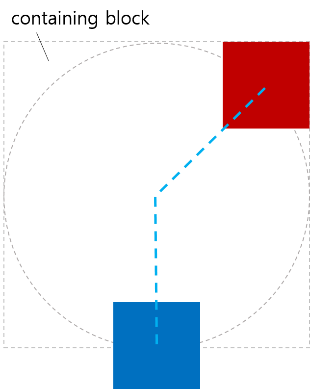
2.1.2. <basic-shape> 배치 예시
< style >
body {
width : 323 px ;
height : 131 px ;
margin : 0 px ;
border : 2 px solid black ;
padding : 8 px ;
transform-style : preserve-3d ;
}
. item {
width : 90 px ;
height : 40 px ;
background-color : violet ;
}
# middle {
offset-position : auto ;
offset-path : circle( 60 % ) margin-box ;
offset-distance : 25 % ;
offset-anchor : left top ;
}
</ style >
< body >
< div class = "item" ></ div >
< div class = "item" id = "middle" ></ div >
< div class = "item" ></ div >
</ body >

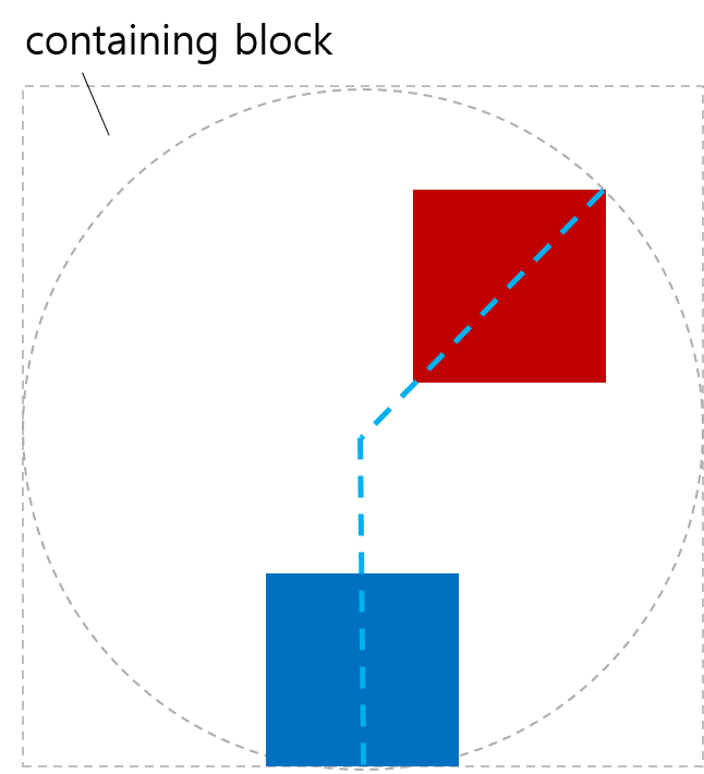
2.1.3. <coord-box> 배치 예시
< style >
body {
width : 500 px ;
height : 300 px ;
border-radius : 80 px ;
border : dashed aqua ;
margin : 0 ;
}
# blueBox {
width : 40 px ;
height : 20 px ;
background-color : blue ;
offset-path : margin-box ;
}
</ style >
< body >
< div id = "blueBox" ></ div >
</ body >

2.2. 경로상의 위치: offset-distance 속성
| 이름: | offset-distance |
|---|---|
| 값: | <length-percentage> |
| 초기값: | 0 |
| 적용 대상: | 변환 가능한 요소(transformable elements) |
| 상속 여부: | no |
| 백분율: | offset path 길이에 상대적 |
| 계산된 값: | 계산된 <length-percentage> 값 |
| 정식 순서: | 문법에 따름(per grammar) |
| 애니메이션 타입: | 계산된 값 기준(by computed value) |
| 미디어: | visual |
offset path를 따라 offset position이 어디에 있는지 지정합니다.
- <length-percentage>
-
offset position은 지정된 거리만큼 요소의 offset path를 따라 위치한 지점입니다. 경로상의 거리 계산 방법은 § 2.2.1 경로를 따라 계산된 거리 산출을 참고하세요.
백분율은 offset path의 전체 길이에 상대적입니다.
테스트
- offset-distance-composition.html (실시간 테스트) (소스)
- offset-distance-interpolation.html (실시간 테스트) (소스)
- offset-distance-interpolation-001.html (실시간 테스트) (소스)
- offset-distance-001.html (live test) (소스)
- offset-distance-002.html (live test) (소스)
- offset-distance-003.html (live test) (소스)
- offset-distance-004.html (live test) (소스)
- offset-distance-005.html (live test) (소스)
- offset-distance-006.html (live test) (소스)
- offset-distance-007.html (live test) (소스)
- offset-distance-008.html (live test) (소스)
- offset-distance-009.html (live test) (소스)
- offset-distance-computed.html (실시간 테스트) (소스)
- offset-distance-parsing-invalid.html (실시간 테스트) (소스)
- offset-distance-parsing-valid.html (실시간 테스트) (소스)
참고: offset-distance를 애니메이션 하면, 요소가 복잡한 경로를 쉽게 따라갈 수 있습니다.
요소에 offset path가 없으면, 이 속성은 아무런 효과가 없습니다.
2.2.1. 경로를 따라 계산된 거리 산출
offset path를 따라 거리를 처리하는 방식은 offset path의 종류에 따라 다릅니다:
-
<angle> offset path와 contain이 있는 경우는 닫히지 않은 구간(unclosed interval)입니다.
-
<angle> offset path와 contain이 없는 경우는 무한(ray)입니다.
-
모든 기본 CSS 도형은 닫힌 루프입니다.
-
Offset path(SVG Path 참조 포함)는 경로 리스트의 마지막 명령이 closepath("z" 또는 "Z")인 경우에만 닫힌 루프이고, 아니면 닫히지 않은 구간입니다.
-
SVG 원, 타원, 이미지, 폴리곤, rect 참조는 닫힌 루프입니다.
-
SVG 선, polyline 참조는 닫히지 않은 구간입니다.
주어진 offset path와 offset distance의 used offset distance를 결정하려면:
-
total length를 offset path의 모든 하위 경로를 포함한 전체 길이로 한다.
-
offset distance를 px로 변환하며, 100%는 total length로 변환한다.
-
- offset path가 무한(ray)인 경우:
-
used offset distance를 offset distance와 동일하게 한다.
- 그 외에 offset path가 contain이 있는 <angle> 경로인 경우:
-
used offset distance를 offset distance(박스가 경로 안에 완전히 포함되도록 clamp 함)로 한다.
- offset path가 다른 닫히지 않은 구간(unclosed interval)인 경우:
-
used offset distance를 offset distance를 0과 경로의 total length 사이로 clamp한 값으로 한다.
- 그 외 offset path가 닫힌 루프(closed loop)인 경우:
-
used offset distance를 offset distance를 경로의 total length로 나눈 나머지(modulo)로 한다. total length가 0이면, used offset distance도 0이다.
참고: “Modulo”는 항상 음수가 아닌 결과가 나오도록 하는 전통적 수학적 정의를 사용합니다.
< style >
. item {
width : 100 px ;
height : 40 px ;
offset-position : 0 % 0 % ;
offset-path : path ( 'm 0 0 h 200 v 150' );
}
# box1 {
background-color : red ;
offset-distance : -280 % ;
}
# box2 {
background-color : green ;
offset-distance : 190 % ;
}
</ style >
< body >
< div class = "item" id = "box1" ></ div >
< div class = "item" id = "box2" ></ div >
</ body >

< style >
. item {
width : 100 px ;
height : 40 px ;
offset-position : 0 % 0 % ;
offset-path : path ( 'm 0 0 h 200 v 150 z' );
}
# box1 {
background-color : red ;
offset-distance : -280 % ;
}
# box2 {
background-color : green ;
offset-distance : 190 % ;
}
</ style >
< body >
< div class = "item" id = "box1" ></ div >
< div class = "item" id = "box2" ></ div >
</ body >

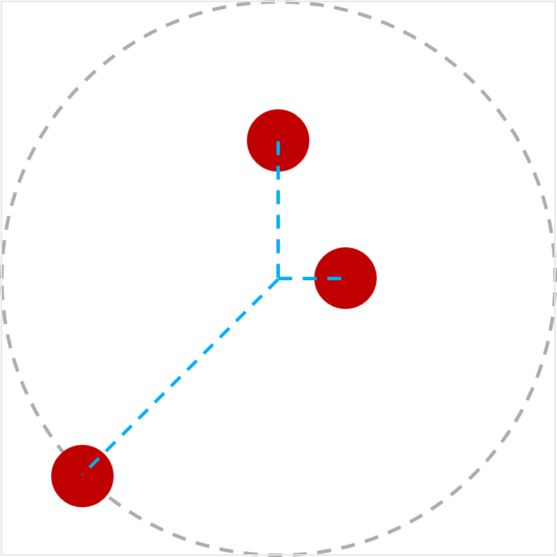
< style >
body {
transform-style : preserve-3d ;
width : 300 px ;
height : 300 px ;
border : dashed gray ;
border-radius : 50 % ;
}
. circleBox {
position : absolute ;
left : 50 % ;
top : 50 % ;
width : 40 px ;
height : 40 px ;
background-color : red ;
border-radius : 50 % ;
}
# circle1 {
offset-path : ray ( 0 deg farthest -side );
offset-distance : 50 % ;
}
# circle2 {
offset-path : ray ( 90 deg farthest -side );
offset-distance : 20 % ;
}
# circle3 {
offset-path : ray ( 225 deg farthest -side );
offset-distance : 100 % ;
}
</ style >
< body >
< div class = "circleBox" id = "circle1" ></ div >
< div class = "circleBox" id = "circle2" ></ div >
< div class = "circleBox" id = "circle3" ></ div >
</ body >
2.3. 경로의 시작점: offset-position 속성
| 이름: | offset-position |
|---|---|
| 값: | normal | auto | <position> |
| 초기값: | normal |
| 적용 대상: | 변환 가능한 요소(transformable elements) |
| 상속 여부: | no |
| 백분율: | containing block의 크기 기준 |
| 계산된 값: | normal 또는 auto 키워드, 또는 계산된 <position> |
| 정식 순서: | 문법에 따름 |
| 애니메이션 타입: | 계산된 값 기준 |
| 미디어: | visual |
<offset-path> 함수에서 자체 시작 위치를 지정하지 않을 경우 사용하는 offset starting position을 지정합니다.
값 정의는 다음과 같습니다:
- normal
-
요소는 offset starting position이 없습니다.
- auto
-
offset starting position은 박스의 왼쪽 위 모서리(top-left corner)입니다.
참고: 이것은 요소의 자기 박스의 왼쪽 위 모서리이며, containing block의 것이 아닙니다! top left 지정과는 완전히 다릅니다. 예를 들어, path()가 요소의 위치 기준으로 시작할 수 있게 하는 용도입니다.
- <position>
-
offset starting position은 <position>을 사용해 박스의 containing block 내에서 0x0 오브젝트 영역의 위치를 정한 결과입니다.
테스트
< style >
# wrap {
position : relative ;
width : 300 px ;
height : 300 px ;
border : 1 px solid black ;
}
# box {
width : 100 px ;
height : 100 px ;
background-color : green ;
position : absolute ;
top : 100 px ;
left : 80 px ;
offset-position : auto ;
offset-anchor : center ;
offset-path : ray ( 45 deg );
}
</ style >
< body >
< div id = "wrap" >
< div id = "box" ></ div >
</ div >
</ body >
< style >
# wrap {
transform-style : preserve-3d ;
width : 400 px ;
height : 350 px ;
}
. item {
position : absolute ;
left : 200 px ;
top : 0 px ;
offset-position : 200 px 100 px ; /* 0px,100px로 이동됨 */
offset-anchor : left top ;
transform-origin : left top ;
width : 130 px ;
height : 80 px ;
border-top-right-radius : 23 px ;
}
# box1 {
background-color : tomato ;
offset-position : auto ;
}
# box2 {
background-color : green ;
}
# box3 {
background-color : navy ;
rotate : 90 deg ; /* 모션 경로 변환 전에 적용됨 */
}
# box4 {
background-color : gold ;
transform : rotate( 90 deg ); /* 모션 경로 변환 후 적용됨 */
}
</ style >
< body >
< div id = "wrap" >
< div class = "item" id = "box1" ></ div >
< div class = "item" id = "box2" ></ div >
< div class = "item" id = "box3" ></ div >
< div class = "item" id = "box4" ></ div >
</ div >
</ body >

< style >
# wrap {
transform-style : preserve-3d ;
width : 500 px ;
height : 250 px ;
line-height : 0 px ;
}
span {
position : static ;
display : inline-block ;
width : 100 px ;
height : 50 px ;
border-top-right-radius : 23 px ;
scale : 2.5 2.5 ; /* 모션 경로 변환 전에 적용됨 */
offset-position : center ;
transform : scale( 0.4 ); /* 모션 경로 변환 후 적용됨 */
}
# box1 {
background-color : tomato ;
}
# box2 {
background-color : green ;
}
# box3 {
background-color : navy ;
}
# box4 {
background-color : gold ;
}
</ style >
< body >
< div id = "wrap" >
< div >
< span id = "box1" ></ span >< span id = "box2" ></ span >
</ div >
< div >
< span id = "box3" ></ span >< span id = "box4" ></ span >
</ div >
</ div >
</ body >

< style >
# wrap {
transform-style : preserve-3d ;
width : 540 px ;
height : 420 px ;
}
. item {
position : absolute ;
width : 90 px ;
height : 70 px ;
border-top-right-radius : 23 px ;
scale : 0.8 0.8 ; /* 모션 경로 변환 전에 적용됨 */
offset-path : padding-box ;
offset-distance : 50 % ;
offset-rotate : 0 deg ;
offset-anchor : right bottom ;
transform : scale( 1.25 ); /* 모션 경로 변환 후 적용됨 */
}
# box1 {
background-color : tomato ;
position : static ;
offset-position : auto ; /* 무시됨 */
}
# box2 {
background-color : green ;
right : 0 px ;
top : 0 px ;
offset-position : 23 % 45 % ; /* 무시됨 */
}
# box3 {
background-color : navy ;
left : 0 px ;
bottom : 0 px ;
offset-position : 34 % 56 px ; /* 무시됨 */
}
# box4 {
background-color : gold ;
right : 0 px ;
bottom : 0 px ;
offset-position : 45 px 67 px ; /* 무시됨 */
}
</ style >
< body >
< div id = "wrap" >
< div class = "item" id = "box1" ></ div >
< div class = "item" id = "box2" ></ div >
< div class = "item" id = "box3" ></ div >
< div class = "item" id = "box4" ></ div >
</ div >
</ body >

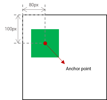
2.4. 요소의 앵커 포인트: offset-anchor 속성
| 이름: | offset-anchor |
|---|---|
| 값: | auto | <position> |
| 초기값: | auto |
| 적용 대상: | 변환 가능한 요소(transformable elements) |
| 상속 여부: | no |
| 백분율: | 요소의 reference box의 너비와 높이에 상대적 |
| 계산된 값: | auto 키워드 또는 계산된 <position> |
| 정식 순서: | 문법에 따름 |
| 애니메이션 타입: | 계산된 값 기준 |
| 미디어: | visual |
요소의 offset anchor point—offset position과 offset path를 따라 정렬되는 지점—을 정의합니다.
값의 의미는 다음과 같습니다:
- auto
-
anchor point는 transform-origin이 지정한 지점과 동일합니다.
구체적으로, computed value인 transform-origin은 요소의 <position>으로 resolve되며, 요소의 reference box를 기준으로 합니다.
- <position>
-
anchor point는 <position>을 요소의 reference box 기준으로 resolve한 결과입니다.
테스트
- offset-anchor-composition.html (실시간 테스트) (소스)
- offset-anchor-interpolation.html (실시간 테스트) (소스)
- offset-anchor-transform-box-fill-box-001.html (실시간 테스트) (소스)
- offset-anchor-transform-box-fill-box-002.html (실시간 테스트) (소스)
- offset-anchor-transform-box-fill-box-003.html (실시간 테스트) (소스)
- offset-anchor-computed.html (실시간 테스트) (소스)
- offset-anchor-parsing-invalid.html (실시간 테스트) (소스)
- offset-anchor-parsing-valid.html (실시간 테스트) (소스)
어떤 박스에 대해 resolve할지에 대한 논의는 Issue 503에서 진행 중입니다.
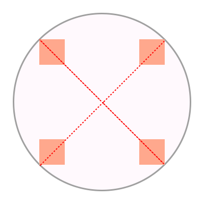
#plane {
    offset-anchor: center;
}
도형 중앙의 빨간 점은 도형의 anchor point를 나타냅니다.

< style >
body {
transform-style : preserve-3d ;
width : 300 px ;
height : 300 px ;
border : 2 px solid gray ;
border-radius : 50 % ;
}
. box {
width : 50 px ;
height : 50 px ;
background-color : orange ;
offset-position : 50 % 50 % ;
offset-distance : 100 % ;
offset-rotate : 0 deg ;
}
# item1 {
offset-path : ray ( 45 deg closest -side );
offset-anchor : right top ;
}
# item2 {
offset-path : ray ( 135 deg closest -side );
offset-anchor : right bottom ;
}
# item3 {
offset-path : ray ( 225 deg closest -side );
offset-anchor : left bottom ;
}
# item4 {
offset-path : ray ( 315 deg closest -side );
offset-anchor : left top ;
}
</ style >
< body >
< div class = "box" id = "item1" ></ div >
< div class = "box" id = "item2" ></ div >
< div class = "box" id = "item3" ></ div >
< div class = "box" id = "item4" ></ div >
</ body >
< style >
body {
width : 500 px ;
height : 500 px ;
}
. box {
background-color : mediumpurple ;
offset-path : none ;
offset-anchor : center ;
}
# item1 {
offset-position : 90 % 20 % ;
width : 60 % ;
height : 20 % ;
}
# item2 {
offset-position : 100 % 100 % ;
width : 30 % ;
height : 10 % ;
}
# item3 {
offset-position : 50 % 100 % ;
width : 20 % ;
height : 60 % ;
}
# item4 {
offset-position : 0 % 100 % ;
width : 30 % ;
height : 90 % ;
}
</ style >
< body >
< div class = "box" id = "item1" ></ div >
< div class = "box" id = "item2" ></ div >
< div class = "box" id = "item3" ></ div >
< div class = "box" id = "item4" ></ div >
</ body >

< style >
body {
width : 500 px ;
height : 500 px ;
}
. box {
background-color : mediumpurple ;
offset-path : none ;
offset-anchor : auto ;
}
# item1 {
offset-position : 90 % 20 % ;
width : 60 % ;
height : 20 % ;
}
# item2 {
offset-position : 100 % 100 % ;
width : 30 % ;
height : 10 % ;
}
# item3 {
offset-position : 50 % 100 % ;
width : 20 % ;
height : 60 % ;
}
# item4 {
offset-position : 0 % 100 % ;
width : 30 % ;
height : 90 % ;
}
</ style >
< body >
< div class = "box" id = "item1" ></ div >
< div class = "box" id = "item2" ></ div >
< div class = "box" id = "item3" ></ div >
< div class = "box" id = "item4" ></ div >
</ body >

2.5. 경로에 맞춰 회전: offset-rotate 속성
| 이름: | offset-rotate |
|---|---|
| 값: | [ auto | reverse ] || <angle> |
| 초기값: | auto |
| 적용 대상: | 변환 가능한 요소(transformable elements) |
| 상속 여부: | no |
| 백분율: | n/a |
| 계산된 값: | auto가 앞에 붙을 수 있는 계산된 <angle> 값 |
| 정식 순서: | 문법에 따름 |
| 애니메이션 타입: | 계산된 값 기준 |
| 미디어: | visual |
offset transform의 회전 컴포넌트를 정의하며, offset path의 offset position에서의 방향을 기반으로 할 수 있습니다. 값의 의미는 다음과 같습니다:
- auto <angle>?
-
offset transform에 회전 컴포넌트가 포함되며, offset path의 offset position에서의 방향과 양의 X축(즉, 오른쪽으로 향하는 선) 방향의 차이만큼 회전합니다. 계산 방법은 SVG의 경로 방향(direction of a path)을 참고하세요.
만약 <angle>이 함께 지정되면, 그 각도가 회전 컴포넌트에 추가됩니다.
참고: 즉, offset path가 오른쪽으로 움직이면 auto는 회전을 추가하지 않습니다. 오른쪽 직선에서 벗어날수록, 회전도 그만큼 적용됩니다. auto와 <angle>를 조합하면 "시작" 회전을 조정할 수 있습니다.
- reverse <angle>?
-
auto와 동일하지만, 추가로 180deg를 더해 회전합니다.
- <angle>
-
단독으로 지정하면, offset transform에 지정한 각도만큼 회전 컴포넌트를 추가합니다. (즉, offset-rotate: 45deg;는 transform: rotate(45deg)와 유사하지만, offset transform의 일부로 처리됩니다.)
테스트
- offset-rotate-composition.html (실시간 테스트) (소스)
- offset-rotate-interpolation-math-functions.html (실시간 테스트) (소스)
- offset-rotate-interpolation.html (실시간 테스트) (소스)
- offset-rotate-interpolation-001.html (실시간 테스트) (소스)
- offset-rotate-001.html (live test) (소스)
- offset-rotate-002.html (live test) (소스)
- offset-rotate-003.html (live test) (소스)
- offset-rotate-004.html (live test) (소스)
- offset-rotate-005.html (live test) (소스)
- offset-rotate-computed.html (실시간 테스트) (소스)
- offset-rotate-parsing-invalid.html (실시간 테스트) (소스)
- offset-rotate-parsing-valid.html (실시간 테스트) (소스)

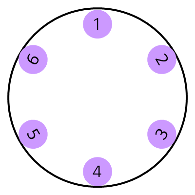
도형의 앵커 포인트가 경로상의 여러 위치에 놓이고 offset-rotate가 0deg이면, 도형은 회전하지 않습니다.

offset-rotate 속성을 auto로 설정하고, 도형의 앵커 포인트를 경로상의 여러 위치에 놓으면, 도형은 현재 위치의 접선에 따라 회전하며 해당 위치에서 경로 방향을 바라봅니다.

이 예시에서는 offset-rotate 속성이 reverse로 설정되어 있습니다. 비행기는 경로의 각 위치에서 경로의 반대 방향을 바라봅니다.

마지막 예시에서는 offset-rotate 속성이 -45deg로 설정되어 있습니다. 도형은 반시계 방향으로 45도 한 번 회전하며, 경로의 각 위치에서 동일한 회전을 유지합니다.

< style >
body {
width : 300 px ;
height : 300 px ;
margin : 0 px ;
border : solid gray ;
border-radius : 50 % ;
}
. circle {
offset-position : 150 px 150 px ;
offset-distance : 86 % ;
width : 42 px ;
height : 42 px ;
background-color : mediumpurple ;
border-radius : 50 % ;
display : flex ;
align-items : center ;
justify-content : center ;
}
# item1 {
offset-path : ray ( 0 deg closest -side );
offset-rotate : auto 90 deg ;
}
# item2 {
offset-path : ray ( 45 deg closest -side );
offset-rotate : auto 90 deg ;
}
# item3 {
offset-path : ray ( 135 deg closest -side );
offset-rotate : auto -90 deg ;
}
# item4 {
offset-path : ray ( 180 deg closest -side );
offset-rotate : auto -90 deg ;
}
# item5 {
offset-path : ray ( 225 deg closest -side );
offset-rotate : reverse 90 deg ;
}
# item6 {
offset-path : ray ( -45 deg closest -side );
offset-rotate : reverse -90 deg ;
}
</ style >
< body >
< div class = "circle" id = "item1" > 1</ div >
< div class = "circle" id = "item2" > 2</ div >
< div class = "circle" id = "item3" > 3</ div >
< div class = "circle" id = "item4" > 4</ div >
< div class = "circle" id = "item5" > 5</ div >
< div class = "circle" id = "item6" > 6</ div >
</ body >
2.6. offset 축약형
| 이름: | offset |
|---|---|
| 값: | [ <'offset-position'>? [ <'offset-path'> [ <'offset-distance'> || <'offset-rotate'> ]? ]? ]! [ / <'offset-anchor'> ]? |
| 초기값: | 개별 속성 참조 |
| 적용 대상: | 변환 가능한 요소(transformable elements) |
| 상속 여부: | 개별 속성 참조 |
| 백분율: | 개별 속성 참조 |
| 계산된 값: | 개별 속성 참조 |
| 애니메이션 타입: | 개별 속성 참조 |
| 정식 순서: | 문법에 따름 |
테스트
- offset-interpolation.html (실시간 테스트) (소스)
- offset-position-composition.html (실시간 테스트) (소스)
- offset-position-interpolation.html (실시간 테스트) (소스)
- offset-parsing-invalid.html (실시간 테스트) (소스)
- offset-parsing-valid.html (실시간 테스트) (소스)
- offset-shorthand.html (live test) (소스)
- inheritance.html (live test) (소스)
- offset-supports-calc.html (live test) (소스)
이 속성은 offset-position, offset-path, offset-distance, offset-rotate, offset-anchor를 한 번에 설정하는 축약형 속성입니다. 생략된 값은 각 속성의 초기값으로 설정됩니다.
2.7. 오프셋 변환 계산
offset transform은 2D 변환으로, 이동(translation) 후 회전(rotation) 순서로 적용됩니다:
-
요소를 (X, Y)만큼 이동하여 anchor point가 offset position과 일치하도록 정렬합니다.
-
offset-rotate로 지정된 각도만큼 요소를 회전합니다.
3. <basic-shape>의 등가 경로
<basic-shape>의 정의는 [css-shapes]에서 각 함수가 도형—윤곽, 내부, 외부가 있는 2차원 도형을 생성한다고 정의합니다.
이 명세에서는 <basic-shape>를 경로(path)—시작점, 끝점, 방향이 있는 선으로 사용하며, 해당 도형의 윤곽을 따라 그려집니다. 경로를 구성하는 자세한 내용은 SVG에서 정의합니다. [SVG2]
모든 <basic-shape> 값에 대한 등가 경로(equivalent path)는 다음과 같습니다:
- <path()>
- <shape()>
-
경로는 정의된 path입니다. [SVG11]
- <circle()>
- <ellipse()>
-
경로는 원/타원의 윤곽선입니다. 시작점은 원/타원의 가장 오른쪽 점이며, 네 개의 원호(각각 1/4씩, 시계 방향, 마지막은 segment-completing close path 연산)로 이루어집니다.
- rect()
- inset()
- xywh()
- inset()
-
경로는 (둥근 모서리가 있을 수 있는) 사각형의 윤곽선입니다. 네 개 또는 여덟 개의 세그먼트(둥근 모서리 여부에 따라 다름)로 이루어지며, 마지막은 segment-completing close path 연산입니다. 시작점은 상단 직선의 왼쪽 끝(둥근 모서리 바로 오른쪽)이고, 시계 방향으로 이어집니다.
- <polygon()>
-
경로는 다각형의 윤곽선으로, 각 좌표쌍을 직선으로 연결하여 이루어지며, 마지막 점은 첫 번째 점과 연결되고, segment-completing close path 연산으로 종료합니다.
이 모든 경로에서, 경로상의 임의의 지점에서의 방향(direction)은 SVG에서 정의합니다. SVG 2 § 9.4 경로 방향성(Path directionality) 참고.
참고: 이 모든 경로는 유사한 SVG shape element에 대해 정의된 "equivalent paths"와 일치하도록 의도되었습니다.
참고: 이 목록은 <basic-shape> 함수 전체와 동기화되어야 합니다. 누락된 것이 있다면, 이는 명세 버그입니다. 향후 Shapes 명세로 이동할 수 있지만, 현재로서는 이 명세만이 해당 정보를 사용하는 유일한 명세이므로 여기에 유지됩니다.
4. 프라이버시 고려사항
이 명세는 새로운 프라이버시 고려사항을 도입하지 않습니다.
5. 보안 고려사항
이 명세는 새로운 보안 고려사항을 도입하지 않습니다.
변경 사항
이 섹션은 규범적이지 않습니다.
2018년 12월 18일 작업 초안 이후의 변경 사항
-
offset-position:normal 추가(기본 위치 덮어쓰지 않음), ray()에 "at <position>" 추가 #504.
-
offset-path를 <url()> 대신 <url> 사용하도록 수정 #508
-
offset transform 계산을 CSS Transforms 1 용어로 다시 서술
-
"offset-distance"와 "offset-rotate" 명확화
-
"contain" 키워드 동작을 간단하고 명확하게 #363.
-
circle()/ellipse()의 등가 경로를 SVG와 일치하도록 변경 #506.
-
coord-box가 변환 요소의 containing block을 설정하는 요소를 참조하도록, SVG에서는 view-box로 처리 #369
-
<basic-shape> 경로 정의를 부록으로 이동
-
<coord-box>가 모든 path 함수와 결합 가능하도록 허용 #369
-
초기 위치 명확화
-
path()를 <basic-shape> 섹션으로 이동
-
<ray-size>를 선택적으로 변경, 기본값은 "closest-side"
-
소개 부분 개정
-
ray() 정의를 별도 소절로 이동
-
offset path 정의 명확화 #66
-
<coord-box> 타입이 CSS Box 3에서 정의됨을 명확화
-
<ray()> 및 <path()> 타입 문법 수정
-
"modulo"가 수학적 정의(음수 없음)를 따름을 명확화 #339.
-
SVG와 일치하도록 경로 경계에서의 방향성 수정 #209.
-
offset-path 섹션 재구성, 가독성 개선
-
극좌표 개념 설명하는 노트 제거
-
offset-distance 계산값을 계산된
값으로 변경 -
animatable을 Animation type으로 대체
2015년 4월 9일 최초 공개 작업 초안 이후 변경 사항
-
motion-path를 offset-path로 이름 변경하여 polar-angle과 통합.
-
motion-offset을 offset-distance로 이름 변경하여 polar-distance과 통합.
-
motion-rotation을 offset-rotate로 이름 변경.
-
경로의 offset-position을 지정할 수 있도록 추가, offset starting position을 경로에 지정하기 위해 polar-origin을 [CSS-ROUND-DISPLAY-1]에서 병합.
-
offset-anchor 추가, 요소의 기준점(origin point)을 지정하기 위해 polar-anchor를 [CSS-ROUND-DISPLAY-1]에서 병합.
-
offset-rotate가 auto 또는 reverse와 <angle>을 조합하여 회전 변환을 지정하도록 함.
감사의 말
fantasai, Hyojin Song, 그리고 CSS WG 멤버 여러분 리뷰, 의견, 교정에 감사드립니다.