1. 소개
이 섹션은 규범적이지 않습니다.
CSS Multicol 1 § 4 열 간격과 규칙은 작성자가 다중 열 컨테이너의 열 사이 간격을 제어하고, 그 공간 안에 선과 같은 보이는 구분선을 그릴 수 있도록 하는 속성을 정의했습니다. 이러한 보이는 구분선을 간격 장식이라고 부릅니다.
이 명세는 이전에 정의된 속성을 확장합니다. 행 방향에 해당하는 동등한 속성을 추가하고, 전체 속성 집합을 다른 컨테이너 유형에도 적용하며, 간격 장식을 어디에 어떻게 그릴지 더 세밀하게 제어할 수 있게 합니다.
1.1. 값 정의
이 명세는 [CSS2]의 CSS 속성 정의 규약을 따르며, [CSS-VALUES-3]의 값 정의 구문을 사용합니다. 이 명세에서 정의되지 않은 값 유형은 CSS Values & Units [CSS-VALUES-3]에서 정의됩니다. 다른 CSS 모듈과 결합하면 이러한 값 유형의 정의가 확장될 수 있습니다.
각 속성 정의에 나열된 속성별 값에 더해, 이 명세에서 정의된 모든 속성은 CSS 전역 키워드도 속성 값으로 허용합니다. 가독성을 위해 이를 명시적으로 반복하지 않았습니다.
2. 박스 사이의 간격
margin과 padding은 개별 박스 주변의 시각적 간격을 지정하는 데 사용할 수 있지만, 주어진 레이아웃 컨텍스트 안에서 인접한 박스 사이의 간격을 전역적으로 지정하는 것이 때로는 더 편리합니다. 특히 형제 박스 사이의 간격이 첫 번째/마지막 박스와 컨테이너 가장자리 사이의 간격과 다를 때 그렇습니다.
gap 속성과, 그 하위 속성인 row-gap 및 column-gap은 이 기능을 다중 열, 플렉스, 및 그리드 레이아웃에 제공합니다.
간격은 열 간격 또는 행 간격 중 하나이며, 그 정의는 컨테이너 유형에 따라 달라집니다:
- 다중 열 컨테이너
-
열 간격은 인접한 열 박스 사이의 거터입니다.
[CSS-MULTICOL-1]을 참조하십시오.
행 간격은 column-height에 의해 설정된 열 박스의 행 사이에 있는 거터입니다. [CSS-MULTICOL-2]를 참조하십시오.
- 플렉스 컨테이너
-
주축에 적용될 때
(예: row 플렉스
컨테이너의 열 간격),
항목 사이의 거터를 가리킵니다
(단일 줄에서 인접한 플렉스 항목 사이에
고정 크기의 추가 margin이 삽입된 것처럼).
교차축에 적용될 때 (예: row 플렉스 컨테이너의 행 간격), 인접한 플렉스 줄 사이의 거터를 가리킵니다.
- 그리드 컨테이너
- 행 간격과 열 간격은, 그리드 컨테이너의 컨텍스트에서, 각각 그리드 행과 그리드 열 사이의 거터를 가리킵니다. 정확한 세부 사항은 CSS Grid Layout 1 § 10.1 거터: row-gap, column-gap 및 gap 속성을 참조하십시오.
거터는 항목 사이에 최소 간격을 만듭니다: 추가 간격은 justify-content/align-content에 의해 더해질 수 있습니다. 이러한 추가 공간은 해당 간격의 크기를 증가시킵니다.
모든 경우에, 간격이 단편화 분리와 일치하면 사라집니다. [CSS-BREAK-3]
참고: 테이블 박스는 셀 사이의 분리를 지정하기 위해 gap 속성을 사용하지 않습니다. 대신 border-spacing 속성을 사용하며, 이 속성은 약간 다른 기능을 가집니다: 상속되며, 가장 바깥쪽 셀과 테이블의 border 사이에 추가 간격도 지정합니다 (space-evenly와 유사하고 space-between과는 다릅니다).
2.1. 행 및 열 거터: row-gap 및 column-gap 속성
| 이름: | row-gap, column-gap |
|---|---|
| 값: | normal | <length-percentage [0,∞]> | <line-width> |
| 초기값: | normal |
| 적용 대상: | 다중 열 컨테이너, 플렉스 컨테이너, 그리드 컨테이너 |
| 상속: | 아니요 |
| 백분율: | § 2.3 gap 속성의 백분율 참조 |
| 계산값: | 지정된 키워드, 그 외에는 계산된 <length-percentage> 값 |
| 정규 순서: | 문법에 따름 |
| 애니메이션 유형: | 계산값 유형에 따름 |
이 속성들은 컨테이너의 항목 사이에 고정 길이 거터를 지정하여, 항목 사이에 공간을 추가합니다—이는 콘텐츠 분배 속성의 space-between 키워드와 유사하지만, 남은 공간의 일부가 아니라 고정 크기라는 점이 다릅니다. column-gap 속성은 “열” 사이의 간격을 지정하여, inline-axis margin과 유사하게 컨테이너의 인라인 축에서 박스를 분리합니다; 반면 row-gap은 “행” 사이의 간격을 나타내어, 컨테이너의 블록 축에서 박스를 분리합니다.
값은 다음 의미를 가집니다:
- <length-percentage [0,∞]>
- <line-width>
-
적용되는 레이아웃 모드에서 정의한 대로 행 간격 또는 열 간격을 지정합니다.
음수 값은 유효하지 않습니다. 백분율에 대해서는 § 2.3 gap 속성의 백분율을 참조하십시오.
- normal
-
normal 값은 다중 열 컨테이너에서는 1em의 사용값을, 그 외 모든 컨텍스트에서는 0px의 사용값을 나타냅니다.
2.2. Gap 단축 표기: gap 속성
| 이름: | gap |
|---|---|
| 값: | <'row-gap'> <'column-gap'>? |
| 초기값: | 개별 속성 참조 |
| 적용 대상: | 다중 열 컨테이너, 플렉스 컨테이너, 그리드 컨테이너 |
| 상속: | 아니요 |
| 백분율: | 콘텐츠 영역의 대응하는 치수를 참조 |
| 계산값: | 개별 속성 참조 |
| 정규 순서: | 문법에 따름 |
| 애니메이션 유형: | 계산값 유형에 따름 |
이 속성은 하나의 선언에서 row-gap과 column-gap을 설정하는 단축 속성입니다. <'column-gap'>이 생략되면, <'row-gap'>과 같은 값으로 설정됩니다.

참고: gap 속성은 박스 사이에 만들어지는 보이는 “gutter” 또는 “alley”의 한 구성 요소일 뿐입니다. margin, padding 또는 분산 정렬의 사용은 박스 사이의 보이는 분리를 gap에 지정된 것보다 더 크게 만들 수 있습니다.
2.3. gap 속성의 백분율
일반적으로, gap 속성이 도입하는 간격은 그 간격의 크기를 가진 빈 항목/트랙/기타 등처럼 동작하도록 의도되었습니다; 다시 말해, 작성자는 컨테이너에 추가적인 빈 항목/트랙/기타 등을 삽입하는 것만으로 gap의 효과를 재현할 수 있어야 합니다.
gap은 항상 요소의 콘텐츠 박스의 대응하는 크기를 기준으로 백분율을 해석합니다. 이 크기가 definite이면, 동작은 잘 정의되어 있으며 레이아웃 모드 전반에서 일관됩니다. 하지만 레이아웃 모드마다 항목/트랙/기타 등의 순환 백분율 크기를 다르게 처리하므로, gap도 마찬가지입니다:
- Grid Layout에서
-
min size 속성과 margin/padding에서처럼 [CSS-SIZING-3], 순환 백분율 크기는 intrinsic size contribution을 결정할 때 0을 기준으로 해석되지만, 박스의 콘텐츠를 배치할 때에는 박스의 콘텐츠 박스를 기준으로 해석됩니다.
- Flex Layout에서
-
순환 백분율 크기는 모든 경우에 0을 기준으로 해석됩니다.
2.4. 레거시 Gap 속성: grid-row-gap, grid-column-gap, 및 grid-gap 속성
Grid Layout 모듈은 원래 자체적인 거터 속성 집합을 가지고 작성되었고, 이후 이러한 모든 속성이 기존 row-gap/column-gap 명명으로 통합되었습니다. 레거시 콘텐츠와의 호환성을 위해, 이러한 grid 접두사 이름은 다음과 같이 지원되어야 합니다:
-
grid-column-gap은 column-gap 속성의 레거시 이름 별칭입니다
3. Gap 장식
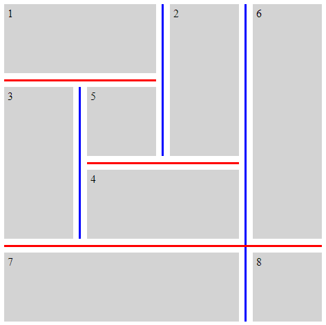
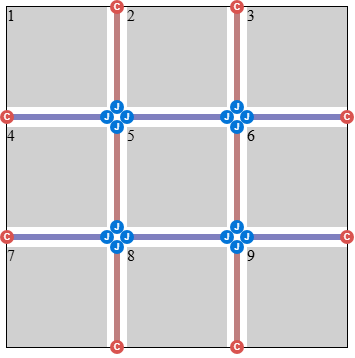
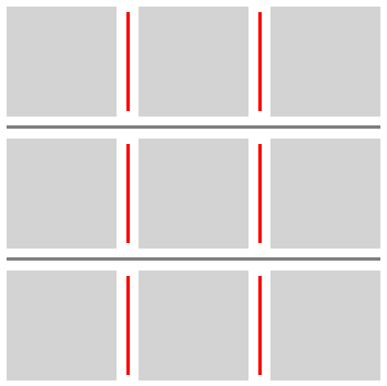
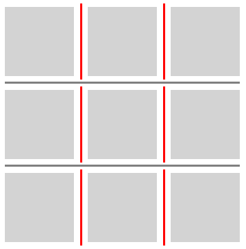
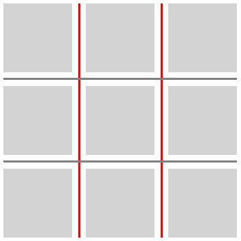
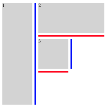
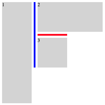
간격은 간격 장식을 포함할 수 있으며, 이는 인접한 박스 사이에 그려지는 보이는 구분선(예: 선)입니다.
간격 장식은 공간을 차지하지 않습니다. 즉, 간격 장식의 존재나 너비는 다른 어떤 것의 배치도 변경하지 않습니다. 간격 장식이 그 간격보다 넓으면, 인접한 박스가 장식과 겹치며, 경우에 따라 장식이 컨테이너의 박스 밖으로 확장될 수 있습니다.
간격 장식은 컨테이너의 border 바로 위에 그려집니다. 스크롤 가능한 컨테이너의 경우, 컨테이너의 border와 background는 스크롤되지 않지만, 장식은 컨테이너 안의 항목과 함께 스크롤되어야 한다는 점에 유의하십시오.
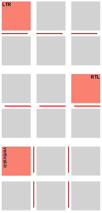
간격 장식은 속성이 적용되는 컨테이너가 배치한 "column"과 "row"의 정의를 따릅니다. 이러한 용어의 의미를 결정할 때에는 컨테이너 유형이 writing mode를 고려하는 방식에 의존합니다. 예시는 다음을 참조하십시오: CSS Multicol 2 § 3 다중 열 모델, CSS Flexbox 1 § 5.1 Flex 흐름 방향: flex-direction 속성, 및 CSS Grid Layout 1 § 3 그리드 레이아웃 개념 및 용어.
이 명세에서 이름이 "column"으로 시작하는 속성은 열 간격에 적용되고, 이름이 "row"로 시작하는 속성은 행 간격에 적용됩니다.
3.1. 기하
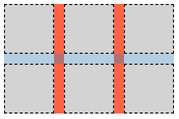
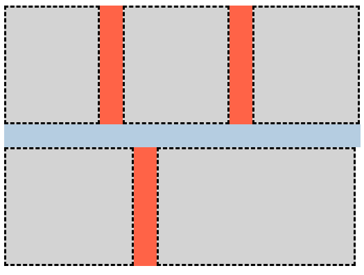
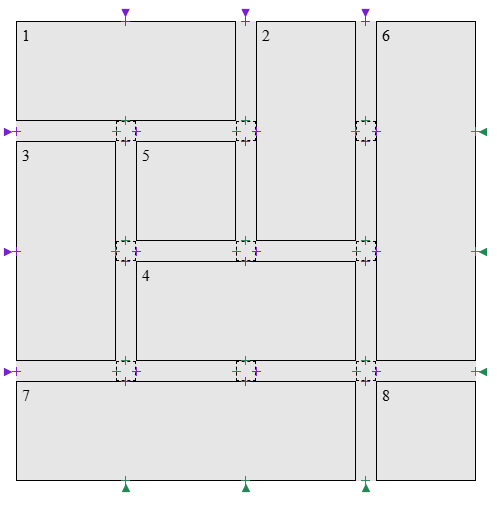
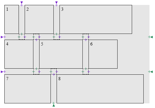
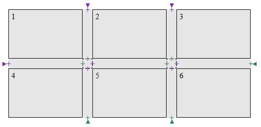
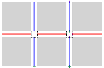
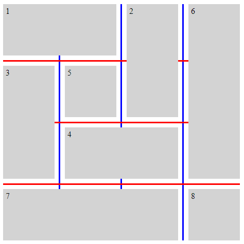
간격 장식은 간격 안에 하나 이상의 간격 장식 세그먼트로 그려집니다.
3.1.1. 세그먼트 끝점
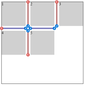
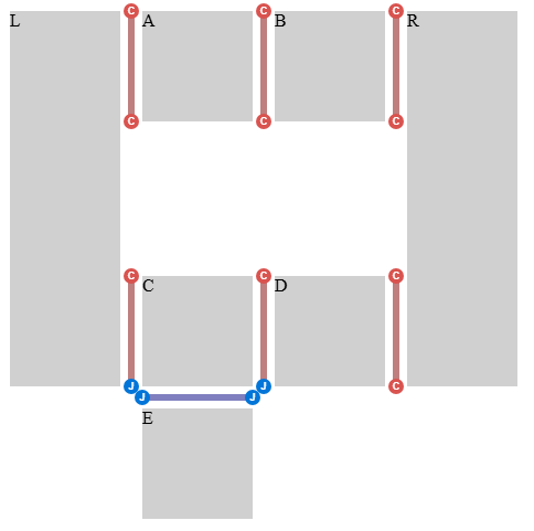
세그먼트 끝점은 간격의 중심선 위에 있는 점으로, 간격 장식 세그먼트가 시작하거나 끝날 수 있는 위치입니다. 끝점 유형은 두 가지입니다:
-
간격의 경계:
G의 두 경계에 끝점을 만듭니다:
- G의 시작 가장자리 중심점에 시작 세그먼트 끝점을 만듭니다.
- G의 끝 가장자리 중심점에 끝 세그먼트 끝점을 만듭니다.
간격이 콘텐츠 경계까지 이어질 때, 이러한 끝점은 해당 콘텐츠 가장자리와 일치합니다.
-
간격 내부:
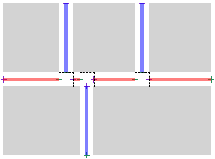
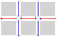
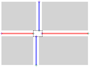
간격 접합부는 하나 이상의 간격이 G와 맞닿거나 겹치는 G의 영역입니다. 각 간격 접합부마다 두 개의 세그먼트 끝점이 만들어집니다:
- 간격 접합부에 진입: G의 적어도 한쪽에 교차 간격이 나타나는 지점에 끝 세그먼트 끝점을 만듭니다.
- 간격 접합부에서 나감: G의 양쪽 어디에도 교차 간격이 존재하지 않는 지점에 시작 세그먼트 끝점을 만듭니다.
이 순서(끝 세그먼트 끝점, 시작 세그먼트 끝점)는 간격 접합부가 한 트랙/항목/열의 끝과 다른 트랙/항목/열의 시작에 해당한다는 점을 반영합니다.
.grid-with-spans {
  display: grid;
  grid-template: repeat(4, 100px) / repeat(4, 100px);
  gap: 20px;
  background: rgb(255 255 128);
}
.grid > * {
  border: 1px dashed black;
}
.flex {
  display: flex;
  flex-wrap: wrap;
  gap: 20px;
  width: 500px;
  background: rgb(255 255 128);
}
.flex > * {
  border: 1px dashed black;
}
.multi-column {
  column-count: 3;
  column-width: 100px;
  column-height: 50px;
  column-wrap: wrap;
  gap: 20px;
  background: rgb(255 255 128);
}

.multi-column > * {
  height: 100px;
  border: 1px dashed black;
}
3.1.2. 간격 장식 세그먼트
정의
간격 장식 세그먼트는 시작 세그먼트 끝점과 끝 세그먼트 끝점을 짝지어 형성됩니다. 각 간격은 간격 장식 세그먼트의 모음을 형성합니다.
이 섹션에서는 간격 장식
세그먼트 s를
s = [s.start, s.end]로 나타냅니다.
여기서 s.start는 세그먼트의 시작 세그먼트 끝점이고,
s.end는 세그먼트의 끝 세그먼트 끝점입니다.
UNION(s1, s2)은 [s1.start, s2.end]와 같다고 둡니다.
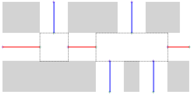
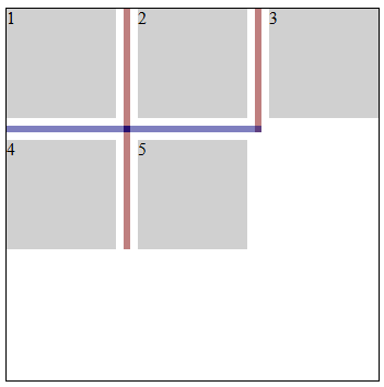
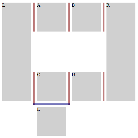
간격 장식 세그먼트는 그 끝점 사이의 모든 간격 접합부에 대해, 해당 접합부에 기여하는 모든 수직 방향 간격을 가로질러 span하는 항목들이 간격의 양쪽에 존재하면 spanning 항목으로 양쪽이 둘러싸인 것입니다.
주어진 간격의 컨텍스트에서, 한 쌍의 세그먼트 끝점 a와 b는 a에서 b까지의 선분이 간격과 같은 너비를 가지고 컨테이너 안의 자식 항목과 교차한다면 불연속으로 간주됩니다.
알고리즘
- S를 빈 목록으로 둡니다.
-
endpoints를 G에 대해 세그먼트 끝점을 만든 결과로 두고,
G의 중심선을 따라 시작에서 끝까지의 위치 순서로 정렬합니다.
참고: 이 목록은 시작 세그먼트 끝점과 끝 세그먼트 끝점이 엄격히 번갈아 나타나며 시작 세그먼트 끝점으로 시작하는 짝수 개의 요소를 포함한다고 보장됩니다.
- endpoints가 비어 있으면 S를 반환합니다.
- break를 간격에 적용되는 것에 따라 column-rule-break 또는 row-rule-break의 사용값으로 둡니다.
-
break가 none이면:
- first를 endpoints의 첫 번째 항목으로 둡니다.
- last를 endpoints의 마지막 항목으로 둡니다.
- 간격 장식 세그먼트 segment = [first, last]를 만듭니다.
- segment에 오프셋을 적용한 다음 S에 추가합니다.
- S를 반환합니다.
- 빈 목록 검사: endpoints가 비어 있으면 S를 반환합니다.
- endpoints의 처음 두 항목으로부터 간격 장식 세그먼트 s를 만듭니다. 두 항목을 모두 목록에서 제거합니다.
- s의 끝점이 불연속이면, 빈 목록 검사로 돌아갑니다.
-
endpoints가 비어 있지 않은 동안:
- endpoints의 처음 두 항목으로부터 간격 장식 세그먼트 next를 만들되, 두 항목 모두 목록에 남겨 둡니다.
- candidate를 UNION(s, next)로 둡니다.
- candidate의 끝점이 불연속이면 이 루프를 종료합니다.
- break가 intersection이고 candidate가 spanning 항목으로 양쪽이 둘러싸인 것이 아니면, 이 루프를 종료합니다.
- endpoints에서 처음 두 항목을 제거합니다.
- s를 UNION(s, next)으로 설정합니다.
- s에 오프셋을 적용한 다음 S에 추가합니다.
- 빈 목록 검사로 돌아갑니다.
- start를 적용 가능한 rule-inset 속성의 사용값만큼 오프셋합니다.
- end를 적용 가능한 rule-inset 속성의 사용값만큼 오프셋합니다.
- s를 조정된 [start, end]로 갱신합니다.
테스트
- flex-gap-decorations-001.html (실시간 테스트) (소스)
- flex-gap-decorations-006.html (실시간 테스트) (소스)
- flex-gap-decorations-007.html (실시간 테스트) (소스)
- flex-gap-decorations-008.html (실시간 테스트) (소스)
- flex-gap-decorations-015.html (실시간 테스트) (소스)
- flex-gap-decorations-016.html (실시간 테스트) (소스)
- flex-gap-decorations-020.html (실시간 테스트) (소스)
- flex-gap-decorations-021.html (실시간 테스트) (소스)
- flex-gap-decorations-022.html (실시간 테스트) (소스)
- flex-gap-decorations-023.html (실시간 테스트) (소스)
- flex-gap-decorations-024.html (실시간 테스트) (소스)
- flex-gap-decorations-025.html (실시간 테스트) (소스)
- flex-gap-decorations-026-crash.html (실시간 테스트) (소스)
- flex-gap-decorations-027.html (실시간 테스트) (소스)
- flex-gap-decorations-032.html (실시간 테스트) (소스)
- flex-gap-decorations-033.html (실시간 테스트) (소스)
- flex-gap-decorations-039.html (실시간 테스트) (소스)
- flex-gap-decorations-040.html (실시간 테스트) (소스)
- flex-gap-decorations-041.html (실시간 테스트) (소스)
- flex-gap-decorations-042.html (실시간 테스트) (소스)
- flex-gap-decorations-043.html (실시간 테스트) (소스)
- flex-gap-decorations-044.html (실시간 테스트) (소스)
- flex-gap-decorations-045.html (실시간 테스트) (소스)
- flex-gap-decorations-046.html (실시간 테스트) (소스)
- flex-gap-decorations-047.html (실시간 테스트) (소스)
- flex-gap-decorations-048.html (실시간 테스트) (소스)
- flex-gap-decorations-049.html (실시간 테스트) (소스)
- flex-gap-decorations-056.html (실시간 테스트) (소스)
- flex-gap-decorations-057.html (실시간 테스트) (소스)
- flex-gap-decorations-058.html (실시간 테스트) (소스)
- flex-gap-decorations-059.html (실시간 테스트) (소스)
- flex-gap-decorations-060.html (실시간 테스트) (소스)
- flex-gap-decorations-061.html (실시간 테스트) (소스)
- flex-gap-decorations-repaint-on-child-resize.html (실시간 테스트) (소스)
- flex-gap-decorations-repaint-on-container-shift.html (실시간 테스트) (소스)
- flex-gap-decorations-writing-mode.html (실시간 테스트) (소스)
- grid-gap-decorations-001.html (실시간 테스트) (소스)
- grid-gap-decorations-029.html (실시간 테스트) (소스)
- grid-gap-decorations-030.html (실시간 테스트) (소스)
- grid-gap-decorations-031.html (실시간 테스트) (소스)
- grid-gap-decorations-032.html (실시간 테스트) (소스)
- grid-gap-decorations-033.html (실시간 테스트) (소스)
- grid-gap-decorations-034.html (실시간 테스트) (소스)
- grid-gap-decorations-035.html (실시간 테스트) (소스)
- grid-gap-decorations-036.html (실시간 테스트) (소스)
- grid-gap-decorations-037.html (실시간 테스트) (소스)
- grid-gap-decorations-041-crash.html (실시간 테스트) (소스)
- grid-gap-decorations-042.html (실시간 테스트) (소스)
- grid-gap-decorations-043-crash.html (실시간 테스트) (소스)
- grid-gap-decorations-044-crash.html (실시간 테스트) (소스)
- grid-gap-decorations-045.html (실시간 테스트) (소스)
- grid-gap-decorations-046.html (실시간 테스트) (소스)
- grid-gap-decorations-047.html (실시간 테스트) (소스)
- grid-gap-decorations-066.html (실시간 테스트) (소스)
- grid-gap-decorations-repaint-on-child-resize.html (실시간 테스트) (소스)
- grid-gap-decorations-repaint-on-item-position-change.html (실시간 테스트) (소스)
- grid-gap-decorations-repaint-on-item-span-change.html (실시간 테스트) (소스)
- grid-gap-decorations-writing-mode.html (실시간 테스트) (소스)
- subgrid-gap-decorations-001.html (실시간 테스트) (소스)
- subgrid-gap-decorations-002.html (실시간 테스트) (소스)
- subgrid-gap-decorations-003.html (실시간 테스트) (소스)
- subgrid-gap-decorations-009.html (실시간 테스트) (소스)
- subgrid-gap-decorations-010.html (실시간 테스트) (소스)
- subgrid-gap-decorations-011.html (실시간 테스트) (소스)
- subgrid-gap-decorations-012.html (실시간 테스트) (소스)
- subgrid-gap-decorations-013.html (실시간 테스트) (소스)
- subgrid-gap-decorations-014.html (실시간 테스트) (소스)
- subgrid-gap-decorations-015.html (실시간 테스트) (소스)
- subgrid-gap-decorations-016.html (실시간 테스트) (소스)
- subgrid-gap-decorations-018.html (실시간 테스트) (소스)
- multicol-gap-decorations-001.html (실시간 테스트) (소스)
- multicol-gap-decorations-002.html (실시간 테스트) (소스)
- multicol-gap-decorations-003.html (실시간 테스트) (소스)
- multicol-gap-decorations-005.html (실시간 테스트) (소스)
- multicol-gap-decorations-006.html (실시간 테스트) (소스)
- multicol-gap-decorations-007.html (실시간 테스트) (소스)
- multicol-gap-decorations-013.html (실시간 테스트) (소스)
- multicol-gap-decorations-015.html (실시간 테스트) (소스)
- multicol-gap-decorations-016.html (실시간 테스트) (소스)
- multicol-gap-decorations-018.html (실시간 테스트) (소스)
- multicol-gap-decorations-024.html (실시간 테스트) (소스)
- multicol-gap-decorations-040.html (실시간 테스트) (소스)
- multicol-gap-decorations-repaint-on-content-resize.html (실시간 테스트) (소스)
- multicol-gap-decorations-writing-mode.html (실시간 테스트) (소스)
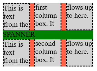
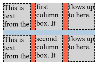
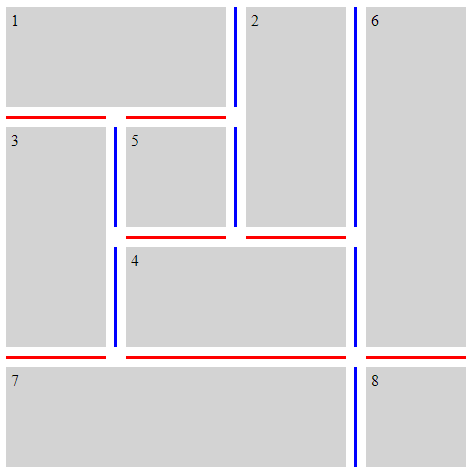
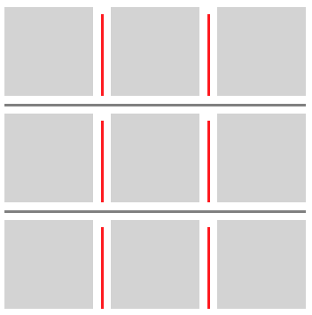
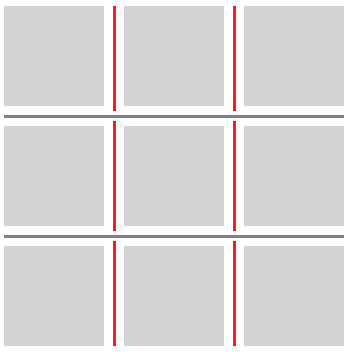
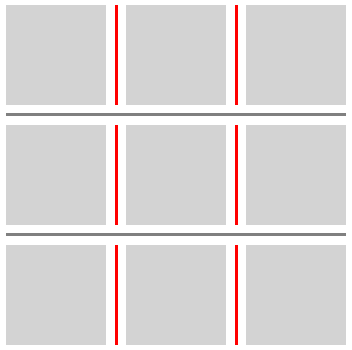
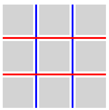
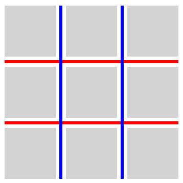
3.2. 교차점에서의 break 동작: column-rule-break, row-rule-break, 및 rule-break 속성
| 이름: | column-rule-break, row-rule-break |
|---|---|
| 값: | none | normal | intersection |
| 초기값: | normal |
| 적용 대상: | 그리드 컨테이너, 플렉스 컨테이너, 다중 열 컨테이너, 및 그리드 레인 컨테이너 |
| 상속: | 아니요 |
| 백분율: | 해당 없음 |
| 계산값: | 지정된 대로 |
| 정규 순서: | 문법에 따름 |
| 애니메이션 유형: | 이산 |
이 속성들은 컨테이너 안의 항목이 형성하는 보이는 "T" 또는 "cross" 교차점에서 주어진 간격 안의 장식을 세그먼트로 끊는 동작을 설정합니다. 이 값들을 적용하는 정확한 세부 사항은 간격 장식 세그먼트를 결정하는 단계에 제시되어 있습니다.
- none
- 간격 장식은 보이는 "T" 또는 "cross" 교차점에서 시작하거나 끝나지 않습니다. 대신, 간격의 한쪽 끝에서 다른 끝까지 하나의 연속된 장식이 그려집니다.
- normal
-
동작은 컨테이너 유형에 따라 달라집니다.
- 그리드 컨테이너
- 간격 장식은 보이는 "T" 교차점에서 시작하고 끝나지만, 보이는 "cross" 교차점은 통과해 계속 이어집니다.
- 플렉스 컨테이너
- none과 동일하게 동작합니다.
- 다중 열 컨테이너
- column-rule-break에서는 intersection과 동일하게 동작합니다. row-rule-break에서는 none과 동일하게 동작합니다.
- intersection
- 간격 장식은 보이는 "T" 및 "cross" 교차점에서 시작하고 끝납니다.
테스트
- flex-gap-decorations-009.html (실시간 테스트) (소스)
- flex-gap-decorations-010.html (실시간 테스트) (소스)
- flex-gap-decorations-028.html (실시간 테스트) (소스)
- flex-gap-decorations-031.html (실시간 테스트) (소스)
- flex-gap-decorations-034.html (실시간 테스트) (소스)
- flex-gap-decorations-035.html (실시간 테스트) (소스)
- flex-gap-decorations-036.html (실시간 테스트) (소스)
- flex-gap-decorations-037.html (실시간 테스트) (소스)
- flex-gap-decorations-050.html (실시간 테스트) (소스)
- flex-gap-decorations-051.html (실시간 테스트) (소스)
- flex-gap-decorations-052.html (실시간 테스트) (소스)
- grid-gap-decorations-006.html (실시간 테스트) (소스)
- grid-gap-decorations-007.html (실시간 테스트) (소스)
- grid-gap-decorations-008.html (실시간 테스트) (소스)
- grid-gap-decorations-009.html (실시간 테스트) (소스)
- grid-gap-decorations-040.html (실시간 테스트) (소스)
- subgrid-gap-decorations-004.html (실시간 테스트) (소스)
- subgrid-gap-decorations-005.html (실시간 테스트) (소스)
- subgrid-gap-decorations-006.html (실시간 테스트) (소스)
- multicol-gap-decorations-014.html (실시간 테스트) (소스)
- multicol-gap-decorations-020.html (실시간 테스트) (소스)
- multicol-gap-decorations-025.html (실시간 테스트) (소스)
- multicol-gap-decorations-026.html (실시간 테스트) (소스)
- multicol-gap-decorations-034.html (실시간 테스트) (소스)
| 이름: | rule-break |
|---|---|
| 값: | <'column-rule-break'> |
| 초기값: | 개별 속성 참조 |
| 적용 대상: | column-rule-break 및 row-rule-break와 동일 |
| 상속: | 개별 속성 참조 |
| 백분율: | 개별 속성 참조 |
| 계산값: | 개별 속성 참조 |
| 애니메이션 유형: | 개별 속성 참조 |
| 정규 순서: | 문법에 따름 |
이 단축 속성은 column-rule-break 및 row-rule-break를 같은 값으로 설정합니다.
테스트
다음 예시는 *-rule-break 속성의 다양한 설정을 보여 줍니다.
.break-normal-grid {
  display: grid;
  grid-template: repeat(4, 100px) / repeat(4, 100px);
  gap: 20px;
  row-rule: 6px solid red;
  column-rule: 6px solid blue;
  rule-break: normal;
}
.break-none-grid {
  display: grid;
  grid-template: repeat(4, 100px) / repeat(4, 100px);
  gap: 20px;
  row-rule: 6px solid red;
  column-rule: 6px solid blue;
  rule-break: none;
}
.break-intersection-grid {
  display: grid;
  grid-template: repeat(4, 100px) / repeat(4, 100px);
  gap: 20px;
  row-rule: 6px solid red;
  column-rule: 6px solid blue;
  rule-break: intersection;
}
.break-normal-multicol {
  column-width: 150px;
  column-height: 300px;
  gap: 1em;
  row-rule: 4px solid red;
  column-rule: 4px solid blue;
  rule-break: normal;
}
.break-intersection-multicol {
  column-width: 150px;
  column-height: 300px;
  gap: 1em;
  row-rule: 4px solid red;
  column-rule: 4px solid blue;
  rule-break: intersection;
}
.break-normal-flex {
  display: flex;
  flex-wrap: wrap;
  gap: 20px;
  row-rule: 6px solid red;
  column-rule: 6px solid blue;
  rule-break: normal;
}
.break-intersection-flex {
  display: flex;
  flex-wrap: wrap;
  width: 500px;
  gap: 20px;
  row-rule: 6px solid red;
  column-rule: 6px solid blue;
  rule-break: intersection;
}
3.3. 간격 장식 끝점 조정: rule-inset 속성
| 이름: | column-rule-inset-cap-start, column-rule-inset-cap-end, column-rule-inset-junction-start, column-rule-inset-junction-end, row-rule-inset-cap-start, row-rule-inset-cap-end, row-rule-inset-junction-start, row-rule-inset-junction-end |
|---|---|
| 값: | <inset-value> |
| 초기값: | 0 |
| 적용 대상: | 그리드 컨테이너, 플렉스 컨테이너, 다중 열 컨테이너, 및 그리드 레인 컨테이너 |
| 상속: | 아니요 |
| 백분율: | 교차 간격 너비를 참조 |
| 계산값: | 지정된 대로 |
| 정규 순서: | 문법에 따름 |
| 애니메이션 유형: | 계산값 유형에 따름 |
<inset-value> = <length-percentage> | overlap-join
이 속성들은 간격 장식의 시작점과 끝점을, 일반적으로 장식이 어디에서 시작하고 끝나는지를 결정하는 세그먼트 끝점에 대해 상대적으로 오프셋하는 데 사용할 수 있습니다.
접합부 세그먼트 끝점은 하나 이상의 다른 간격 장식 세그먼트도 존재하는 간격 접합부에 있는 세그먼트 끝점입니다.
캡 세그먼트 끝점은 접합부 세그먼트 끝점이 아닌 모든 세그먼트 끝점입니다. 여기에는 컨테이너의 콘텐츠 가장자리에 있는 끝점뿐 아니라, 다른 간격 장식 세그먼트가 존재하지 않는 간격 접합부의 끝점도 포함됩니다.
.simple-grid {
  rule-break: intersection;
  rule-visibility-items: between;
}
.simple-grid-with-empty-cells {
  rule-break: intersection;
  rule-visibility-items: between;
}
.donut-grid-layout {
  rule-break: intersection;
  rule-visibility-items: between;
}
백분율은 다음과 같이 정의되는 교차 간격 너비를 기준으로 해석됩니다:
- 간격 접합부에 있는 세그먼트 끝점
-
교차 간격
너비는
세그먼트 끝점이
놓여 있는 간격과 같은 차원에서의
간격 접합부 크기입니다
(행 간격의 경우 행 차원,
열
간격의 경우 열 차원).
참고: 일반적으로 이는 교차하거나 맞닿는 간격에 적용되는 column-gap 또는 row-gap 속성의 사용값에, justify-content 또는 align-content로 인해 추가된 간격을 더한 값이 됩니다. 그러나 간격들이 겹치는 구간에서 서로 교차하거나 맞닿는 경우, 교차 간격 너비는 그러한 구간들의 합집합에 의해 결정됩니다. 이러한 경우의 예는 이 예시를 참조하십시오.
- 기타 세그먼트 끝점
- 교차 간격 너비는 0입니다.
참고: 이 위치 기반 분류는 캡 세그먼트 끝점 / 접합부 세그먼트 끝점 분류와는 별개입니다. 캡 세그먼트 끝점은 컨테이너 가장자리 또는 간격 접합부에 있을 수 있습니다 (이 예시 참조). 따라서 column-rule-inset-cap-start: 50%는 내부 캡에서는 간격 접합부 크기의 절반으로 해석되고, 컨테이너 가장자리 같은 다른 캡에서는 0으로 해석됩니다.
column-rule-inset-cap-start 및 row-rule-inset-cap-start 속성은 캡 세그먼트 끝점인 시작 세그먼트 끝점에 적용됩니다. column-rule-inset-junction-start 및 row-rule-inset-junction-start 속성은 접합부 세그먼트 끝점인 시작 세그먼트 끝점에 적용됩니다. 이러한 속성에서 양수 값은 간격의 축을 따라 끝 방향으로 오프셋하고, 음수 값은 시작 방향으로 오프셋합니다.
column-rule-inset-cap-end 및 row-rule-inset-cap-end 속성은 캡 세그먼트 끝점인 끝 세그먼트 끝점에 적용됩니다. column-rule-inset-junction-end 및 row-rule-inset-junction-end 속성은 접합부 세그먼트 끝점인 끝 세그먼트 끝점에 적용됩니다. 이러한 속성에서 양수 값은 간격의 축을 따라 시작 방향으로 오프셋하고, 음수 값은 끝 방향으로 오프셋합니다.
overlap-join 키워드는 같은 간격 접합부에서 만나는 간격 장식 사이에 깔끔한 연결을 만듭니다:
- 접합부 세그먼트 끝점에서, 간격 장식은 교차 간격 너비의 절반에 교차 간격의 column-rule-width 또는 row-rule-width(적용되는 쪽)의 사용값 절반을 더한 만큼 간격 접합부 안으로 확장됩니다.
- 캡 세그먼트 끝점에서 overlap-join은 0으로 처리됩니다.
.inset-overlap-join {
  rule-inset: overlap-join;
  rule-break: intersection;
  rule-visibility-items: between;
}
.inset-overlap-join {
  rule-inset: overlap-join;
  rule-break: intersection;
  rule-visibility-items: between;
}
.inset-end {
  row-rule: 3px solid red;
  row-rule-break: intersection;
  row-rule-inset-end: 10px;
}
테스트
- flex-gap-decorations-011.html (실시간 테스트) (소스)
- flex-gap-decorations-013.html (실시간 테스트) (소스)
- flex-gap-decorations-014.html (실시간 테스트) (소스)
- flex-gap-decorations-029.html (실시간 테스트) (소스)
- flex-gap-decorations-030.html (실시간 테스트) (소스)
- flex-gap-decorations-053.html (실시간 테스트) (소스)
- flex-gap-decorations-054.html (실시간 테스트) (소스)
- flex-gap-decorations-055.html (실시간 테스트) (소스)
- flex-gap-decorations-063.html (실시간 테스트) (소스)
- flex-gap-decorations-064.html (실시간 테스트) (소스)
- flex-gap-decorations-065.html (실시간 테스트) (소스)
- flex-gap-decorations-066.html (실시간 테스트) (소스)
- flex-gap-decorations-067.html (실시간 테스트) (소스)
- flex-gap-decorations-direction-inset.html (실시간 테스트) (소스)
- grid-gap-decorations-010.html (실시간 테스트) (소스)
- grid-gap-decorations-011.html (실시간 테스트) (소스)
- grid-gap-decorations-012.html (실시간 테스트) (소스)
- grid-gap-decorations-013.html (실시간 테스트) (소스)
- grid-gap-decorations-014.html (실시간 테스트) (소스)
- grid-gap-decorations-015.html (실시간 테스트) (소스)
- grid-gap-decorations-038.html (실시간 테스트) (소스)
- grid-gap-decorations-052.html (실시간 테스트) (소스)
- grid-gap-decorations-053.html (실시간 테스트) (소스)
- grid-gap-decorations-067.html (실시간 테스트) (소스)
- grid-gap-decorations-068.html (실시간 테스트) (소스)
- grid-gap-decorations-069.html (실시간 테스트) (소스)
- grid-gap-decorations-070.html (실시간 테스트) (소스)
- grid-gap-decorations-071.html (실시간 테스트) (소스)
- grid-gap-decorations-072.html (실시간 테스트) (소스)
- grid-gap-decorations-073.html (실시간 테스트) (소스)
- grid-gap-decorations-074.html (실시간 테스트) (소스)
- grid-gap-decorations-075.html (실시간 테스트) (소스)
- grid-gap-decorations-076.html (실시간 테스트) (소스)
- grid-gap-decorations-077.html (실시간 테스트) (소스)
- grid-gap-decorations-078.html (실시간 테스트) (소스)
- grid-gap-decorations-079.html (실시간 테스트) (소스)
- grid-gap-decorations-080.html (실시간 테스트) (소스)
- grid-gap-decorations-081.html (실시간 테스트) (소스)
- grid-gap-decorations-082.html (실시간 테스트) (소스)
- grid-gap-decorations-090.html (실시간 테스트) (소스)
- grid-gap-decorations-091.html (실시간 테스트) (소스)
- grid-gap-decorations-092.html (실시간 테스트) (소스)
- grid-gap-decorations-direction-inset.html (실시간 테스트) (소스)
- subgrid-gap-decorations-007.html (실시간 테스트) (소스)
- subgrid-gap-decorations-008.html (실시간 테스트) (소스)
- multicol-gap-decorations-008.html (실시간 테스트) (소스)
- multicol-gap-decorations-009.html (실시간 테스트) (소스)
- multicol-gap-decorations-010.html (실시간 테스트) (소스)
- multicol-gap-decorations-011.html (실시간 테스트) (소스)
- multicol-gap-decorations-012.html (실시간 테스트) (소스)
- multicol-gap-decorations-017.html (실시간 테스트) (소스)
- multicol-gap-decorations-022.html (실시간 테스트) (소스)
- multicol-gap-decorations-023.html (실시간 테스트) (소스)
- multicol-gap-decorations-033.html (실시간 테스트) (소스)
- multicol-gap-decorations-036.html (실시간 테스트) (소스)
- multicol-gap-decorations-037.html (실시간 테스트) (소스)
- multicol-gap-decorations-038.html (실시간 테스트) (소스)
- multicol-gap-decorations-039.html (실시간 테스트) (소스)
- multicol-gap-decorations-direction-inset.html (실시간 테스트) (소스)
- rule-inset-cap-start-end-computed.html (실시간 테스트) (소스)
- rule-inset-cap-start-end-invalid.html (실시간 테스트) (소스)
- rule-inset-junction-start-end-computed.html (실시간 테스트) (소스)
- rule-inset-junction-start-end-invalid.html (실시간 테스트) (소스)
3.3.1. -start 및 -end 단축 표기
이 단축 표기들은 작성자가 균일한 비대칭 장식을 만들 수 있게 합니다.
.inset-start-8px-end-0px {
  column-rule-inset-start: 8px;
  column-rule-inset-end: 0px;
}
| 이름: | column-rule-inset-start, column-rule-inset-end, row-rule-inset-start, row-rule-inset-end |
|---|---|
| 값: | <inset-value> |
| 초기값: | 개별 속성 참조 |
| 적용 대상: | column-rule-inset-cap-start, column-rule-inset-junction-start, column-rule-inset-cap-end, column-rule-inset-junction-end, row-rule-inset-cap-start, row-rule-inset-junction-start, row-rule-inset-cap-end, 및 row-rule-inset-junction-end와 동일 |
| 상속: | 개별 속성 참조 |
| 백분율: | 개별 속성 참조 |
| 계산값: | 개별 속성 참조 |
| 애니메이션 유형: | 개별 속성 참조 |
| 정규 순서: | 문법에 따름 |
이 단축 속성들은 대응하는 -cap- 및 -junction- 속성을 같은 값으로 설정합니다. 예를 들어, column-rule-inset-start는 column-rule-inset-cap-start와 column-rule-inset-junction-start를 같은 값으로 설정합니다.
| 이름: | rule-inset-start |
|---|---|
| 값: | <'column-rule-inset-start'> |
| 초기값: | 개별 속성 참조 |
| 적용 대상: | column-rule-inset-start 및 row-rule-inset-start와 동일 |
| 상속: | 개별 속성 참조 |
| 백분율: | 개별 속성 참조 |
| 계산값: | 개별 속성 참조 |
| 애니메이션 유형: | 개별 속성 참조 |
| 정규 순서: | 문법에 따름 |
이 단축 속성은 column-rule-inset-start와 row-rule-inset-start를 같은 값으로 설정합니다.
| 이름: | rule-inset-end |
|---|---|
| 값: | <'column-rule-inset-end'> |
| 초기값: | 개별 속성 참조 |
| 적용 대상: | column-rule-inset-end 및 row-rule-inset-end와 동일 |
| 상속: | 개별 속성 참조 |
| 백분율: | 개별 속성 참조 |
| 계산값: | 개별 속성 참조 |
| 애니메이션 유형: | 개별 속성 참조 |
| 정규 순서: | 문법에 따름 |
이 단축 속성은 column-rule-inset-end와 row-rule-inset-end를 같은 값으로 설정합니다.
테스트
3.3.2. -cap- 및 -junction- 단축 표기
이 단축 표기들은 작성자가 캡 세그먼트 끝점과 접합부 세그먼트 끝점에서 서로 다른 처리를 할 수 있게 합니다.
.inset-cap-0px-inset-junction-negative-5px {
  column-rule-inset-cap: 0px;
  column-rule-inset-junction: -5px;
  column-rule-break: intersection;
}
| 이름: | column-rule-inset-cap, column-rule-inset-junction, row-rule-inset-cap, row-rule-inset-junction |
|---|---|
| 값: | <inset-value> <inset-value>? |
| 초기값: | 개별 속성 참조 |
| 적용 대상: | column-rule-inset-cap-start, column-rule-inset-cap-end, column-rule-inset-junction-start, column-rule-inset-junction-end, row-rule-inset-cap-start, row-rule-inset-cap-end, row-rule-inset-junction-start, 및 row-rule-inset-junction-end와 동일 |
| 상속: | 개별 속성 참조 |
| 백분율: | 개별 속성 참조 |
| 계산값: | 개별 속성 참조 |
| 애니메이션 유형: | 개별 속성 참조 |
| 정규 순서: | 문법에 따름 |
이 단축 표기들은 대응하는 -start 및 -end 속성을 설정합니다. 예를 들어, column-rule-inset-cap은 column-rule-inset-cap-start와 column-rule-inset-cap-end를 모두 설정합니다. 값 하나가 지정되면 두 속성 모두 그 값으로 설정됩니다. 두 값이 지정되면 -start는 첫 번째 값으로, -end는 두 번째 값으로 설정됩니다.
| 이름: | rule-inset-cap |
|---|---|
| 값: | <'column-rule-inset-cap'> |
| 초기값: | 개별 속성 참조 |
| 적용 대상: | column-rule-inset-cap 및 row-rule-inset-cap와 동일 |
| 상속: | 개별 속성 참조 |
| 백분율: | 개별 속성 참조 |
| 계산값: | 개별 속성 참조 |
| 애니메이션 유형: | 개별 속성 참조 |
| 정규 순서: | 문법에 따름 |
이 단축 속성은 column-rule-inset-cap과 row-rule-inset-cap를 같은 값으로 설정합니다.
| 이름: | rule-inset-junction |
|---|---|
| 값: | <'column-rule-inset-junction'> |
| 초기값: | 개별 속성 참조 |
| 적용 대상: | column-rule-inset-junction 및 row-rule-inset-junction와 동일 |
| 상속: | 개별 속성 참조 |
| 백분율: | 개별 속성 참조 |
| 계산값: | 개별 속성 참조 |
| 애니메이션 유형: | 개별 속성 참조 |
| 정규 순서: | 문법에 따름 |
이 단축 속성은 column-rule-inset-junction과 row-rule-inset-junction를 같은 값으로 설정합니다.
테스트
- rule-inset-cap-bidirectional-shorthand.html (실시간 테스트) (소스)
- rule-inset-cap-junction-computed.html (실시간 테스트) (소스)
- rule-inset-cap-junction-invalid.html (실시간 테스트) (소스)
- rule-inset-cap-junction-shorthand.html (실시간 테스트) (소스)
- rule-inset-cap-junction-valid.html (실시간 테스트) (소스)
- rule-inset-junction-bidirectional-shorthand.html (실시간 테스트) (소스)
3.3.3. 범용 단축 표기
이 단축 표기들은 작성자가 컨테이너 전체에서 균일한 처리를 할 수 있게 합니다.
.inset-0px {
  column-rule-inset: 0px;
  column-rule-break: intersection;
}
.inset-positive-5px {
  column-rule-inset: 5px;
  column-rule-break: intersection;
}
.inset-negative-5px {
  column-rule-inset: -5px;
  column-rule-break: intersection;
}
.inset-negative-50percent {
  column-rule-inset: -50%;
  column-rule-break: intersection;
}
| 이름: | column-rule-inset, row-rule-inset |
|---|---|
| 값: | <'column-rule-inset-cap'> [ / <'column-rule-inset-junction'> ]? |
| 초기값: | 개별 속성 참조 |
| 적용 대상: | column-rule-inset-cap, column-rule-inset-junction, row-rule-inset-cap, 및 row-rule-inset-junction와 동일 |
| 상속: | 개별 속성 참조 |
| 백분율: | 개별 속성 참조 |
| 계산값: | 개별 속성 참조 |
| 애니메이션 유형: | 개별 속성 참조 |
| 정규 순서: | 문법에 따름 |
이 단축 표기들은 대응하는 cap 및 junction의 시작과 끝 값을 설정합니다. 값의 순서는 다음과 같습니다:
cap-start cap-end? [/ junction-start junction-end?]?
생략된 값은 다음과 같이 채워집니다:
- junction 값이 생략되면 cap 값에서 복사됩니다.
- 생략된 모든 end 값은 대응하는 start 값에서 복사됩니다.
| 이름: | rule-inset |
|---|---|
| 값: | <'column-rule-inset'> |
| 초기값: | 개별 속성 참조 |
| 적용 대상: | column-rule-inset 및 row-rule-inset와 동일 |
| 상속: | 개별 속성 참조 |
| 백분율: | 개별 속성 참조 |
| 계산값: | 개별 속성 참조 |
| 애니메이션 유형: | 개별 속성 참조 |
| 정규 순서: | 문법에 따름 |
이 단축 속성은 column-rule-inset과 row-rule-inset를 같은 값으로 설정합니다.
테스트
3.4. 간격 장식 가시성: rule-visibility-items 속성
| 이름: | column-rule-visibility-items, row-rule-visibility-items |
|---|---|
| 값: | all | around | between | normal |
| 초기값: | normal |
| 적용 대상: | 그리드 컨테이너 및 다중 열 컨테이너 |
| 상속: | 아니요 |
| 백분율: | 해당 없음 |
| 계산값: | 지정된 대로 |
| 정규 순서: | 문법에 따름 |
| 애니메이션 유형: | 이산 |
이 속성들은 간격 장식 세그먼트가 빈 영역에 인접한 간격의 부분에 그려지는지 여부를 제어합니다.
- all
- 인접한 항목이 있는지와 관계없이 모든 간격 세그먼트에 장식을 그립니다.
- around
- 두 인접 영역 중 적어도 하나가 항목으로 점유되어 있으면 간격 세그먼트에 장식을 그립니다.
- between
- 두 인접 영역이 모두 항목으로 점유되어 있으면 간격 세그먼트에 장식을 그립니다.
- normal
-
동작은 컨테이너 유형에 따라 달라집니다.
- 그리드 컨테이너
- all과 동일하게 동작합니다.
- 다중 열 컨테이너
- column-rule-visibility-items에서는 between과 동일하게 동작합니다. row-rule-visibility-items에서는 all과 동일하게 동작합니다.
| 이름: | rule-visibility-items |
|---|---|
| 값: | <'column-rule-visibility-items'> |
| 초기값: | 개별 속성 참조 |
| 적용 대상: | column-rule-visibility-items 및 row-rule-visibility-items와 동일 |
| 상속: | 개별 속성 참조 |
| 백분율: | 개별 속성 참조 |
| 계산값: | 개별 속성 참조 |
| 애니메이션 유형: | 개별 속성 참조 |
| 정규 순서: | 문법에 따름 |
이 단축 속성은 column-rule-visibility-items와 row-rule-visibility-items를 같은 값으로 설정합니다.
.break-normal-with-all-grid {
  display: grid;
  grid-template: repeat(3, 100px) / repeat(3, 100px);
  gap: 20px;
  row-rule: 6px solid red;
  column-rule: 6px solid blue;
  rule-visibility-items: all;
}
.break-normal-with-around-grid {
  display: grid;
  grid-template: repeat(3, 100px) / repeat(3, 100px);
  gap: 20px;
  row-rule: 6px solid red;
  column-rule: 6px solid blue;
  rule-visibility-items: around;
}
.break-normal-with-between-grid {
  display: grid;
  grid-template: repeat(3, 100px) / repeat(3, 100px);
  gap: 20px;
  row-rule: 6px solid red;
  column-rule: 6px solid blue;
  rule-visibility-items: between;
}
테스트
- grid-gap-decorations-fragmentation-025.html (실시간 테스트) (소스)
- grid-gap-decorations-fragmentation-026.html (실시간 테스트) (소스)
- grid-gap-decorations-fragmentation-027.html (실시간 테스트) (소스)
- grid-gap-decorations-054.html (실시간 테스트) (소스)
- grid-gap-decorations-055.html (실시간 테스트) (소스)
- grid-gap-decorations-056.html (실시간 테스트) (소스)
- grid-gap-decorations-057.html (실시간 테스트) (소스)
- grid-gap-decorations-064.html (실시간 테스트) (소스)
- grid-gap-decorations-065.html (실시간 테스트) (소스)
- subgrid-gap-decorations-019.html (실시간 테스트) (소스)
- subgrid-gap-decorations-020.html (실시간 테스트) (소스)
- subgrid-gap-decorations-021.html (실시간 테스트) (소스)
- subgrid-gap-decorations-022.html (실시간 테스트) (소스)
- subgrid-gap-decorations-023.html (실시간 테스트) (소스)
- subgrid-gap-decorations-024.html (실시간 테스트) (소스)
- subgrid-gap-decorations-025.html (실시간 테스트) (소스)
- multicol-gap-decorations-027.html (실시간 테스트) (소스)
- multicol-gap-decorations-028.html (실시간 테스트) (소스)
- multicol-gap-decorations-029.html (실시간 테스트) (소스)
- multicol-gap-decorations-030.html (실시간 테스트) (소스)
- multicol-gap-decorations-031.html (실시간 테스트) (소스)
- multicol-gap-decorations-032.html (실시간 테스트) (소스)
- multicol-gap-decorations-035.html (실시간 테스트) (소스)
- rule-visibility-items-computed.html (실시간 테스트) (소스)
- rule-visibility-items-invalid.html (실시간 테스트) (소스)
- rule-visibility-items-shorthand.html (실시간 테스트) (소스)
- rule-visibility-items-valid.html (실시간 테스트) (소스)
3.5. 간격 장식 겹침: rule-overlap 속성
| 이름: | rule-overlap |
|---|---|
| 값: | row-over-column | column-over-row |
| 초기값: | row-over-column |
| 적용 대상: | 그리드 컨테이너, 플렉스 컨테이너, 및 그리드 레인 컨테이너 |
| 상속: | 아니요 |
| 백분율: | 해당 없음 |
| 계산값: | 지정된 대로 |
| 정규 순서: | 문법에 따름 |
| 애니메이션 유형: | 이산 |
이 속성은 겹치는 간격 장식의 그리기 순서를 설정합니다.
- row-over-column
- 행 방향 장식이 열 방향 장식 위에 그려집니다.
- column-over-row
- 열 방향 장식이 행 방향 장식 위에 그려집니다.
.row-over-column {
  rule-overlap: row-over-column;
  row-rule: 6px solid red;
  column-rule: 6px solid blue;
}
.column-over-row {
  rule-overlap: column-over-row;
  row-rule: 6px solid red;
  column-rule: 6px solid blue;
}
테스트
3.6. 단편화
CSS Box Alignment 3 § 8.1 행 및 열 거터: row-gap 및 column-gap 속성은 간격이 단편화 분리와 일치하는 곳에서 사라진다고 명시합니다. 그러한 위치에는 간격이 없으므로, 그 안에는 간격 장식도 그려지지 않습니다.
테스트
- flex-gap-decorations-fragmentation-001.html (실시간 테스트) (소스)
- flex-gap-decorations-fragmentation-002.html (실시간 테스트) (소스)
- flex-gap-decorations-fragmentation-003.html (실시간 테스트) (소스)
- flex-gap-decorations-fragmentation-004.html (실시간 테스트) (소스)
- flex-gap-decorations-fragmentation-005.html (실시간 테스트) (소스)
- flex-gap-decorations-fragmentation-006.html (실시간 테스트) (소스)
- flex-gap-decorations-fragmentation-007.html (실시간 테스트) (소스)
- flex-gap-decorations-fragmentation-008.html (실시간 테스트) (소스)
- flex-gap-decorations-fragmentation-009.html (실시간 테스트) (소스)
- flex-gap-decorations-fragmentation-010.html (실시간 테스트) (소스)
- flex-gap-decorations-fragmentation-011.html (실시간 테스트) (소스)
- flex-gap-decorations-fragmentation-012.html (실시간 테스트) (소스)
- flex-gap-decorations-fragmentation-013.html (실시간 테스트) (소스)
- flex-gap-decorations-fragmentation-014.html (실시간 테스트) (소스)
- flex-gap-decorations-fragmentation-015.html (실시간 테스트) (소스)
- flex-gap-decorations-fragmentation-016.html (실시간 테스트) (소스)
- flex-gap-decorations-fragmentation-017.html (실시간 테스트) (소스)
- flex-gap-decorations-fragmentation-018.html (실시간 테스트) (소스)
- flex-gap-decorations-fragmentation-019.html (실시간 테스트) (소스)
- flex-gap-decorations-fragmentation-020.html (실시간 테스트) (소스)
- flex-gap-decorations-fragmentation-021.html (실시간 테스트) (소스)
- flex-gap-decorations-fragmentation-022-crash.html (실시간 테스트) (소스)
- flex-gap-decorations-fragmentation-026.html (실시간 테스트) (소스)
- grid-gap-decorations-fragmentation-001.html (실시간 테스트) (소스)
- grid-gap-decorations-fragmentation-002.html (실시간 테스트) (소스)
- grid-gap-decorations-fragmentation-003.html (실시간 테스트) (소스)
- grid-gap-decorations-fragmentation-004.html (실시간 테스트) (소스)
- grid-gap-decorations-fragmentation-005.html (실시간 테스트) (소스)
- grid-gap-decorations-fragmentation-006.html (실시간 테스트) (소스)
- grid-gap-decorations-fragmentation-007.html (실시간 테스트) (소스)
- grid-gap-decorations-fragmentation-008.html (실시간 테스트) (소스)
- grid-gap-decorations-fragmentation-009.html (실시간 테스트) (소스)
- grid-gap-decorations-fragmentation-010.html (실시간 테스트) (소스)
- grid-gap-decorations-fragmentation-011.html (실시간 테스트) (소스)
- grid-gap-decorations-fragmentation-012.html (실시간 테스트) (소스)
- grid-gap-decorations-fragmentation-013.html (실시간 테스트) (소스)
- grid-gap-decorations-fragmentation-014.html (실시간 테스트) (소스)
- grid-gap-decorations-fragmentation-015.html (실시간 테스트) (소스)
- grid-gap-decorations-fragmentation-016.html (실시간 테스트) (소스)
- grid-gap-decorations-fragmentation-017.html (실시간 테스트) (소스)
- grid-gap-decorations-fragmentation-018-crash.html (실시간 테스트) (소스)
- grid-gap-decorations-fragmentation-019-crash.html (실시간 테스트) (소스)
- grid-gap-decorations-fragmentation-020.html (실시간 테스트) (소스)
- grid-gap-decorations-fragmentation-021.html (실시간 테스트) (소스)
- grid-gap-decorations-fragmentation-022.html (실시간 테스트) (소스)
- grid-gap-decorations-fragmentation-023.html (실시간 테스트) (소스)
- grid-gap-decorations-fragmentation-024.html (실시간 테스트) (소스)
- grid-gap-decorations-fragmentation-025.html (실시간 테스트) (소스)
- grid-gap-decorations-fragmentation-026.html (실시간 테스트) (소스)
- grid-gap-decorations-fragmentation-027.html (실시간 테스트) (소스)
- grid-gap-decorations-fragmentation-028.html (실시간 테스트) (소스)
- grid-gap-decorations-fragmentation-029.html (실시간 테스트) (소스)
- grid-gap-decorations-fragmentation-030.html (실시간 테스트) (소스)
- grid-gap-decorations-fragmentation-031.html (실시간 테스트) (소스)
- grid-gap-decorations-fragmentation-032.html (실시간 테스트) (소스)
- grid-gap-decorations-fragmentation-033.html (실시간 테스트) (소스)
- grid-gap-decorations-fragmentation-036.html (실시간 테스트) (소스)
- grid-gap-decorations-fragmentation-037.html (실시간 테스트) (소스)
- subgrid-gap-decorations-fragmentation-001.html (실시간 테스트) (소스)
- subgrid-gap-decorations-fragmentation-002.html (실시간 테스트) (소스)
- subgrid-gap-decorations-fragmentation-003.html (실시간 테스트) (소스)
- subgrid-gap-decorations-fragmentation-004.html (실시간 테스트) (소스)
- subgrid-gap-decorations-fragmentation-005.html (실시간 테스트) (소스)
- subgrid-gap-decorations-fragmentation-006.html (실시간 테스트) (소스)
- subgrid-gap-decorations-fragmentation-007.html (실시간 테스트) (소스)
- subgrid-gap-decorations-fragmentation-008.html (실시간 테스트) (소스)
- subgrid-gap-decorations-fragmentation-009.html (실시간 테스트) (소스)
- subgrid-gap-decorations-fragmentation-010.html (실시간 테스트) (소스)
- subgrid-gap-decorations-fragmentation-011.html (실시간 테스트) (소스)
- subgrid-gap-decorations-fragmentation-012.html (실시간 테스트) (소스)
- subgrid-gap-decorations-fragmentation-013.html (실시간 테스트) (소스)
- subgrid-gap-decorations-fragmentation-014.html (실시간 테스트) (소스)
- subgrid-gap-decorations-fragmentation-015.html (실시간 테스트) (소스)
- subgrid-gap-decorations-fragmentation-016.html (실시간 테스트) (소스)
- subgrid-gap-decorations-fragmentation-017.html (실시간 테스트) (소스)
- subgrid-gap-decorations-fragmentation-018.html (실시간 테스트) (소스)
- subgrid-gap-decorations-fragmentation-019.html (실시간 테스트) (소스)
- subgrid-gap-decorations-fragmentation-020.html (실시간 테스트) (소스)
- subgrid-gap-decorations-fragmentation-021.html (실시간 테스트) (소스)
- subgrid-gap-decorations-fragmentation-022.html (실시간 테스트) (소스)
4. 색상, 스타일 및 너비
이 절의 속성 정의는 [CSS-MULTICOL-1]에 있는 같은 이름의 속성 정의를 대체합니다.
4.1. 간격 장식 색상: column-rule-color, row-rule-color, 및 rule-color 속성
| 이름: | column-rule-color, row-rule-color |
|---|---|
| 값: | <line-color-list> | <auto-line-color-list> |
| 초기값: | currentcolor |
| 적용 대상: | 그리드 컨테이너, 플렉스 컨테이너, 다중 열 컨테이너, 및 그리드 레인 컨테이너 |
| 상속: | 아니요 |
| 백분율: | 해당 없음 |
| 계산값: | 지정된 대로 |
| 정규 순서: | 문법에 따름 |
| 애니메이션 유형: | 반복 가능 목록, § 4.7 목록 값의 보간 참조. |
<line-color-list>          = <line-color-or-repeat>#

<auto-line-color-list>     = <line-color-or-repeat>#? ,
                             <auto-repeat-line-color> ,
                             <line-color-or-repeat>#?

<line-color-or-repeat>     = [ <color> | <repeat-line-color> ]

<repeat-line-color>        = repeat( [ <integer [1,∞]> ] , [ <color> ]# )

<auto-repeat-line-color>   = repeat( auto , [ <color> ]# )
이 속성들은 간격 장식의 색상을 설정합니다.
| 이름: | rule-color |
|---|---|
| 값: | <'column-rule-color'> |
| 초기값: | 개별 속성 참조 |
| 적용 대상: | column-rule-color 및 row-rule-color와 동일 |
| 상속: | 아니요 |
| 백분율: | 개별 속성 참조 |
| 계산값: | 개별 속성 참조 |
| 애니메이션 유형: | 개별 속성 참조 |
| 정규 순서: | 문법에 따름 |
이 단축 속성은 column-rule-color와 row-rule-color를 같은 값으로 설정합니다.
테스트
- gap-decorations-003.html (실시간 테스트) (소스)
- gap-decorations-004.html (실시간 테스트) (소스)
- gap-decorations-010-crash.html (실시간 테스트) (소스)
- flex-gap-decorations-multi-value-direction.html (실시간 테스트) (소스)
- flex-gap-decorations-multi-value-writing-mode.html (실시간 테스트) (소스)
- grid-gap-decorations-022.html (실시간 테스트) (소스)
- grid-gap-decorations-024.html (실시간 테스트) (소스)
- grid-gap-decorations-025.html (실시간 테스트) (소스)
- grid-gap-decorations-026.html (실시간 테스트) (소스)
- grid-gap-decorations-027.html (실시간 테스트) (소스)
- grid-gap-decorations-028.html (실시간 테스트) (소스)
- grid-gap-decorations-048.html (실시간 테스트) (소스)
- grid-gap-decorations-049.html (실시간 테스트) (소스)
- grid-gap-decorations-050.html (실시간 테스트) (소스)
- grid-gap-decorations-051.html (실시간 테스트) (소스)
- grid-gap-decorations-multi-value-direction.html (실시간 테스트) (소스)
- grid-gap-decorations-multi-value-writing-mode.html (실시간 테스트) (소스)
- grid-gap-decorations-visited-alpha-clamp.html (실시간 테스트) (소스)
- multicol-gap-decorations-019.html (실시간 테스트) (소스)
- multicol-gap-decorations-multi-value-direction.html (실시간 테스트) (소스)
- multicol-gap-decorations-multi-value-writing-mode.html (실시간 테스트) (소스)
- gap-decorations-color-computed.html (실시간 테스트) (소스)
- gap-decorations-color-invalid.html (실시간 테스트) (소스)
- gap-decorations-color-valid.html (실시간 테스트) (소스)
4.2. 간격 장식 스타일: column-rule-style, row-rule-style, 및 rule-style 속성
| 이름: | column-rule-style, row-rule-style |
|---|---|
| 값: | <line-style-list> | <auto-line-style-list> |
| 초기값: | none |
| 적용 대상: | 그리드 컨테이너, 플렉스 컨테이너, 다중 열 컨테이너, 및 그리드 레인 컨테이너 |
| 상속: | 아니요 |
| 백분율: | 해당 없음 |
| 계산값: | 지정된 대로 |
| 정규 순서: | 문법에 따름 |
| 애니메이션 유형: | 이산 |
<line-style-list>          = <line-style-or-repeat>#

<auto-line-style-list>     = <line-style-or-repeat>#? ,
                             <auto-repeat-line-style> ,
                             <line-style-or-repeat>#?

<line-style-or-repeat>     = [ <line-style> | <repeat-line-style> ]

<repeat-line-style>        = repeat( [ <integer [1,∞]> ] , [ <line-style> ]# )

<auto-repeat-line-style>   = repeat( auto , [ <line-style> ]# )
이 속성들은 간격 장식의 스타일을 설정합니다. <line-style> 값은 border-style과 동일하게 적용됩니다.
| 이름: | rule-style |
|---|---|
| 값: | <'column-rule-style'> |
| 초기값: | 개별 속성 참조 |
| 적용 대상: | column-rule-style 및 row-rule-style와 동일 |
| 상속: | 아니요 |
| 백분율: | 개별 속성 참조 |
| 계산값: | 개별 속성 참조 |
| 애니메이션 유형: | 개별 속성 참조 |
| 정규 순서: | 문법에 따름 |
이 단축 속성은 column-rule-style와 row-rule-style를 같은 값으로 설정합니다.
테스트
- flex-gap-decorations-002.html (실시간 테스트) (소스)
- flex-gap-decorations-003.html (실시간 테스트) (소스)
- flex-gap-decorations-004.html (실시간 테스트) (소스)
- flex-gap-decorations-005.html (실시간 테스트) (소스)
- flex-gap-decorations-017.html (실시간 테스트) (소스)
- flex-gap-decorations-018.html (실시간 테스트) (소스)
- grid-gap-decorations-002.html (실시간 테스트) (소스)
- grid-gap-decorations-003.html (실시간 테스트) (소스)
- grid-gap-decorations-004.html (실시간 테스트) (소스)
- grid-gap-decorations-005.html (실시간 테스트) (소스)
- grid-gap-decorations-016.html (실시간 테스트) (소스)
- grid-gap-decorations-017.html (실시간 테스트) (소스)
- grid-gap-decorations-020.html (실시간 테스트) (소스)
- grid-gap-decorations-021.html (실시간 테스트) (소스)
- grid-gap-decorations-039.html (실시간 테스트) (소스)
- gap-decorations-style-computed.html (실시간 테스트) (소스)
- gap-decorations-style-invalid.html (실시간 테스트) (소스)
- gap-decorations-style-valid.html (실시간 테스트) (소스)
4.3. 간격 장식 너비: column-rule-width, row-rule-width, 및 rule-width 속성
| 이름: | column-rule-width, row-rule-width |
|---|---|
| 값: | <line-width-list> | <auto-line-width-list> |
| 초기값: | medium |
| 적용 대상: | 그리드 컨테이너, 플렉스 컨테이너, 다중 열 컨테이너, 및 그리드 레인 컨테이너 |
| 상속: | 아니요 |
| 백분율: | 해당 없음 |
| 계산값: | 절대 길이의 목록, 테두리 너비로 스냅됨 |
| 정규 순서: | 문법에 따름 |
| 애니메이션 유형: | 반복 가능 목록, § 4.7 목록 값의 보간 참조. |
<line-width-list>          = <line-width-or-repeat>#

<auto-line-width-list>     = <line-width-or-repeat>#? ,
                             <auto-repeat-line-width> ,
                             <line-width-or-repeat>#?

<line-width-or-repeat>     = [ <line-width> | <repeat-line-width> ]

<repeat-line-width>        = repeat( [ <integer [1,∞]> ] , [ <line-width> ]# )

<auto-repeat-line-width>   = repeat( auto , [ <line-width> ]# )
이 속성들은 간격 장식의 너비를 설정합니다. 음수 값은 허용되지 않습니다.
| 이름: | rule-width |
|---|---|
| 값: | <'column-rule-width'> |
| 초기값: | 개별 속성 참조 |
| 적용 대상: | column-rule-width 및 row-rule-width와 동일 |
| 상속: | 아니요 |
| 백분율: | 개별 속성 참조 |
| 계산값: | 개별 속성 참조 |
| 애니메이션 유형: | 개별 속성 참조 |
| 정규 순서: | 문법에 따름 |
이 단축 속성은 column-rule-width와 row-rule-width를 같은 값으로 설정합니다.
테스트
- gap-decorations-009-crash.html (실시간 테스트) (소스)
- grid-gap-decorations-018.html (실시간 테스트) (소스)
- grid-gap-decorations-019.html (실시간 테스트) (소스)
- multicol-gap-decorations-004.html (실시간 테스트) (소스)
- gap-decorations-col-rule-width.html (실시간 테스트) (소스)
- gap-decorations-width-computed.html (실시간 테스트) (소스)
- gap-decorations-width-invalid.html (실시간 테스트) (소스)
- gap-decorations-width-valid.html (실시간 테스트) (소스)
4.4. 간격 장식 단축 속성: column-rule, row-rule, 및 rule 속성
| 이름: | column-rule, row-rule |
|---|---|
| 값: | <gap-rule-list> | <gap-auto-rule-list> |
| 초기값: | 개별 속성 참조 |
| 적용 대상: | 개별 속성 참조 |
| 상속: | 개별 속성 참조 |
| 백분율: | 개별 속성 참조 |
| 계산값: | 개별 속성 참조 |
| 애니메이션 유형: | 개별 속성 참조 |
| 정규 순서: | 문법에 따름 |
<gap-rule-list>        = <gap-rule-or-repeat>#

<gap-auto-rule-list>   = <gap-rule-or-repeat>#? ,
                         <gap-auto-repeat-rule> ,
                         <gap-rule-or-repeat>#?

<gap-rule-or-repeat>   = <gap-rule> | <gap-repeat-rule>

<gap-repeat-rule>      = repeat( <integer [1,∞]> , <gap-rule># )

<gap-auto-repeat-rule> = repeat( auto , <gap-rule># )

<gap-rule>             = <line-width> || <line-style> || <color>
이 단축 속성들은 column-rule-width, column-rule-style, 및 column-rule-color 속성, 또는 각각 row-rule-width, row-rule-style, 및 row-rule-color 속성의 값을 설정합니다.
| 이름: | rule |
|---|---|
| 값: | <'column-rule'> |
| 초기값: | 개별 속성 참조 |
| 적용 대상: | column-rule 및 row-rule와 동일 |
| 상속: | 아니요 |
| 백분율: | 개별 속성 참조 |
| 계산값: | 개별 속성 참조 |
| 애니메이션 유형: | 개별 속성 참조 |
| 정규 순서: | 문법에 따름 |
이 단축 속성은 column-rule 및 row-rule를 같은 값으로 설정합니다.
테스트
- flex-gap-decorations-019.html (실시간 테스트) (소스)
- gap-decorations-bidirectional-shorthands.html (실시간 테스트) (소스)
- gap-decorations-rule-initial-value-crash.html (실시간 테스트) (소스)
- gap-decorations-rule-shorthand-computed.html (실시간 테스트) (소스)
- gap-decorations-rule-shorthand-invalid.html (실시간 테스트) (소스)
- gap-decorations-rule-shorthand-valid.html (실시간 테스트) (소스)
- gap-decorations-rule-shorthand.html (실시간 테스트) (소스)
4.5. 값 목록과 repeat() 표기법
이 절의 각 속성은 쉼표로 구분된 값 목록을 허용합니다. 이런 방식으로 여러 값을 설정하면 주어진 컨테이너 안에서 간격 장식을 다양하게 만들 수 있습니다.
column-rule-width: 1px;
column-rule-style: solid;
column-rule-color: red, blue;
이러한 목록에는 repeat() 표기법이 포함될 수 있습니다. CSS Grid Layout 1 § 7.2.3 행과 열 반복: repeat() 표기법과 유사하게, 이 표기법은 반복 패턴을 보이는 일련의 간격 장식을 더 간결한 형태로 작성할 수 있게 합니다.
repeat() 구문의 일반적인 형식은 대략 다음과 같습니다.
repeat( [ <integer [1,∞]> | auto ] , <value># )
repeat()의 첫 번째 인수는 반복 횟수를 지정합니다.
- <integer>
- 정수 반복자를 지정합니다. 정수 반복자는 두 번째 인수의 값 목록으로 펼쳐지며, 첫 번째 인수에 지정된 횟수만큼 반복됩니다.
- auto
- 자동 반복자를 지정합니다. 자동 반복자는 목록의 다른 부분에서 값을 받지 못하는 간격을 위한 값을 채우는 데 사용됩니다. 주어진 값 목록에서 repeat() 중 최대 하나만 자동 반복자일 수 있습니다.
repeat()의 두 번째 인수는 repeat()가 나타나는 속성에서 허용되는, 쉼표로 구분된 값 목록입니다.
4.6. 간격 장식 값을 간격에 할당하기
간격 장식은 할당되며, 이는 거터 접힘이 적용된 뒤에 이루어집니다. 주어진 접힌 거터 집합은 정확히 하나의 간격 장식을 소비합니다. 다음 간격 장식은 다음 거터(또는 접힌 거터 집합)에 적용됩니다. 따라서 접힌 거터는 장식 목적상 하나의 간격으로 처리됩니다.
단편화 때문에 억제된 간격도 패턴에서 간격 장식 값을 소비하지만, 실제 장식은 그곳에 그려지지 않습니다. 이는 단편화된 컨텍스트와 단편화되지 않은 컨텍스트 전체에서 간격과 장식 사이의 일관된 연결을 유지합니다.
마찬가지로, 플렉스 컨테이너가 여러 플렉스 줄로 줄바꿈될 때, 장식 패턴은 flexbox 전체의 간격에 순차적으로 할당되며 각 플렉스 줄의 시작에서 다시 시작하지 않습니다.
- values 안의 모든 정수 반복자를 펼쳐진 동등한 값으로 대체합니다.
-
목록에 자동 반복자가 없으면:
- values의 첫 번째 항목과 gaps의 첫 번째 항목부터 시작하여, 각 값을 대응하는 간격에 할당합니다. 값이 간격보다 적으면, values의 첫 번째 항목부터 필요한 만큼 반복합니다.
- 이 알고리즘을 종료합니다.
- values에는 자동 반복자가 포함되어 있습니다. leading count를 자동 반복자 앞에 있는 values 항목 수로 둡니다. trailing count를 자동 반복자 뒤에 있는 values 항목 수로 둡니다.
-
gaps를 다음과 같이 분할합니다:
- leading gaps가 gaps의 처음 leading count개 항목을 포함하게 합니다.
- trailing gaps가 gaps의 마지막 trailing count개 항목을 포함하게 하되, leading gaps에 있는 항목은 제외합니다.
- auto gaps가 leading gaps나 trailing gaps 어느 쪽에도 속하지 않는 gaps의 모든 항목을 포함하게 합니다.
- leading gaps가 비어 있지 않으면, values의 처음 leading count개 항목을 사용하여 leading gaps에 간격 장식 값을 할당합니다.
- trailing gaps가 비어 있지 않으면, values의 처음 trailing count개 항목을 사용하여 trailing gaps에 간격 장식 값을 할당합니다.
- auto gaps가 비어 있지 않으면, 자동 반복자의 두 번째 인수에 있는 값 목록을 사용하여 auto gaps에 간격 장식 값을 할당합니다.
테스트
- gap-decorations-011-crash.html (실시간 테스트) (소스)
- grid-gap-decorations-058-crash.html (실시간 테스트) (소스)
- grid-gap-decorations-059-crash.html (실시간 테스트) (소스)
- grid-gap-decorations-060-crash.html (실시간 테스트) (소스)
- grid-gap-decorations-061.html (실시간 테스트) (소스)
- grid-gap-decorations-062.html (실시간 테스트) (소스)
- grid-gap-decorations-063.html (실시간 테스트) (소스)
- grid-gap-decorations-collapsed-all-auto-fit.html (실시간 테스트) (소스)
- grid-gap-decorations-collapsed-leading-auto-fit.html (실시간 테스트) (소스)
- grid-gap-decorations-collapsed-leading-spanner.html (실시간 테스트) (소스)
- grid-gap-decorations-collapsed-middle-auto-fit.html (실시간 테스트) (소스)
- grid-gap-decorations-collapsed-middle-spanner.html (실시간 테스트) (소스)
- grid-gap-decorations-collapsed-trailing-auto-fit.html (실시간 테스트) (소스)
- grid-gap-decorations-collapsed-trailing-spanner.html (실시간 테스트) (소스)
4.7. 목록 값의 보간
repeat() 값이나 rule-color 또는 rule-width의 값 목록을 보간할 때, 보간은 다음의 두 단계로 진행됩니다:
@keyframes example{ from{ column-rule-width : 10 px ; } to{ column-rule-width : 20 px , 40 px ; } }
위 값들을 보간하면 "from"과 "to" 값이 확장되어 동일한 길이의 목록들이 생성됩니다:
From:   10px, 10px
At 50%: 15px, 25px
To:     20px, 40px
@keyframes example{ from{ column-rule-width : repeat ( 2 , 5 px , 10 px ); } to{ column-rule-width : repeat ( 2 , 15 px , 20 px ); } }
위 값들을 보간하면 "from"과 "to" 값이 확장되어 동일한 길이의 목록들이 생성됩니다:
From:    5px, 10px,  5px, 10px
At 50%: 10px, 15px, 10px, 15px
To:     15px, 20px, 15px, 20px
@keyframes example{ from{ column-rule-width : repeat ( 2 , 10 px , 20 px ); } to{ column-rule-width : 20 px ; } }
위 값들을 보간하면 "from"과 "to" 값이 확장되어 동일한 길이의 목록들이 생성됩니다:
From:   10px, 20px, 10px, 20px
At 50%: 15px, 20px, 15px, 20px
To:     20px, 20px, 20px, 20px
@keyframes example{ from{ column-rule-width : repeat ( 2 , 10 px , 20 px ); } to{ column-rule-width : 20 px , 30 px ; } }
위 값들을 보간하면 "from"과 "to" 값이 확장되어 동일한 길이의 목록들이 생성됩니다:
From:   10px, 20px, 10px, 20px
At 50%: 15px, 25px, 15px, 25px
To:     20px, 30px, 20px, 30px
만약 우리가 보간하려는 두 목록(from 및 to) 중 어느 하나라도 auto 반복자를 포함한다면:
- from과 to 각각을 세그먼트로 분할합니다. 이는 갭 장식 값을 할당하는 방식과 유사합니다:
- from과 to 중 오직 하나만 auto 반복자를 포함한다면, 불연속(discrete) 보간으로 처리합니다.
- 각 세그먼트의 정수 반복자는 모두 확장합니다.
- from의 leading values 길이와 to의 leading values 길이가 일치하지 않으면 불연속 보간으로 처리합니다. from의 trailing values 길이와 to의 trailing values 길이가 일치하지 않으면 불연속 보간으로 처리합니다.
- from과 to가 모두 auto 반복자를 갖고, 위에서 설명한 세그먼트의 길이가 일치하면 각 auto values의 값 목록에 repeatable list 보간을 적용합니다.
@keyframes example{ from{ column-rule-width : 10 px , repeat ( auto, 20 px ), 30 px } to{ column-rule-width : 20 px , repeat ( auto, 40 px ), 40 px } }
from와 to 전반의 leading values 및 trailing values 길이가 일치하므로, 우리는 각 세그먼트에 대해 반복 가능한 목록 알고리즘을 적용할 수 있습니다.
From:   10px, repeat(auto, 20px), 30px
At 50%: 15px, repeat(auto, 30px), 35px
To:     20px, repeat(auto, 40px), 40px
@keyframes example{ from{ column-rule-width : 10 px , 20 px , repeat ( auto, 20 px ), 30 px } to{ column-rule-width : 20 px , 30 px , repeat ( auto, 40 px , 50 px ), 40 px } }
from와 to 전반의 leading values 및 trailing values 길이가 일치하므로, 우리는 각 세그먼트에 대해 반복 가능한 목록 알고리즘을 적용할 수 있습니다.
From:   10px, 20px, repeat(auto, 20px, 20px), 30px
At 50%: 15px, 25px, repeat(auto, 30px, 35px), 35px
To:     20px, 30px, repeat(auto, 40px, 50px), 40px
@keyframes example{ from{ column-rule-width : 10 px , repeat ( auto, 20 px ) } to{ column-rule-width : 20 px , 30 px , repeat ( auto, 40 px , 50 px ) } }
from의 leading values 길이와 to의 leading values 길이가 일치하지 않으므로, 우리는 불연속 보간으로 되돌아갑니다.
@keyframes example{ from{ column-rule-width : 10 px , repeat ( auto, 20 px ), 30 px } to{ column-rule-width : 20 px , repeat ( auto, 40 px ), 40 px , 50 px } }
from의 trailing values 길이와 to의 trailing values 길이가 일치하지 않으므로, 우리는 불연속 보간으로 되돌아갑니다.
테스트
- column-rule-inset-interpolation.html (live test) (source)
- gap-decorations-color-neutral-keyframe-001.html (live test) (source)
- gap-decorations-color-neutral-keyframe-002.html (live test) (source)
- gap-decorations-color-neutral-keyframe-003.html (live test) (source)
- gap-decorations-color-neutral-keyframe-004.html (live test) (source)
- gap-decorations-color-neutral-keyframe-005.html (live test) (source)
- gap-decorations-inset-neutral-keyframe-001.html (live test) (source)
- gap-decorations-inset-neutral-keyframe-002.html (live test) (source)
- gap-decorations-width-neutral-keyframe-001.html (live test) (source)
- gap-decorations-width-neutral-keyframe-002.html (live test) (source)
- gap-decorations-width-neutral-keyframe-003.html (live test) (source)
- gap-decorations-width-neutral-keyframe-004.html (live test) (source)
- gap-decorations-width-neutral-keyframe-005.html (live test) (source)
- row-rule-color-interpolation.html (live test) (source)
- row-rule-inset-interpolation.html (live test) (source)
- row-rule-width-interpolation.html (live test) (source)
- rule-color-interpolation-conversion-001.html (live test) (source)
- rule-color-interpolation-conversion-002.html (live test) (source)
- rule-color-interpolation-conversion-crash.html (live test) (source)
- rule-color-interpolation-multiple-values-001.html (live test) (source)
- rule-color-interpolation-repeaters-001.html (live test) (source)
- rule-width-interpolation-conversion-001.html (live test) (source)
- rule-width-interpolation-conversion-002.html (live test) (source)
- rule-width-interpolation-multiple-values-001.html (live test) (source)
- rule-width-interpolation-multiple-values-002.html (live test) (source)
- rule-width-interpolation-repeaters.html (live test) (source)
4.8. 직렬화
column-rule, row-rule, 및 rule 약어는 구성 요소인 롱핸드 속성들로부터 직렬화되지만, 이는 롱핸드 속성들이 반복자 정렬(repeater aligned)된 경우에만 해당합니다. 롱핸드 속성들이 반복자 정렬되지 않은 경우, 약어는 빈 문자열로 직렬화됩니다.
W, S, C를 각각 너비, 스타일, 색상 롱핸드 속성들의 값이라고 하자. 각 값은 항목들의 목록이며, 항목은 단일 값이거나 repeat() 표기일 수 있습니다. 롱핸드 속성들이 반복자 정렬되었다고 함은 다음 모든 조건이 참일 때에만 성립합니다:
-
W, S 및 C가 모두 동일한 항목 수를 갖습니다.
-
각 항목 인덱스 i에 대해, W[i], S[i] 및 C[i]는 모두 동일한 형태를 가집니다:
-
이들은 모두 비반복 값(non-repeat values), 모두 정수 반복자(integer repeaters), 또는 모두 auto 반복자여야 합니다.
-
각 repeat() 표기법은 동일한 수의 값을 포함해야 합니다.
-
이 약어 선언:
column-rule: 1px solid red, 2px dashed green, 3px dotted blue;
는 다음과 같은 롱핸드 값들로 분해됩니다:
column-rule-width: 1px, 2px, 3px;
column-rule-style: solid, dashed, dotted;
column-rule-color: red, green, blue;
롱핸드들이 반복자 정렬되어 있으므로, 이들은 원래의 약어 값으로 동일하게 직렬화됩니다: 세 속성 모두 동일한 항목 수(3)를 가지며, 각 항목은 단일 값입니다(반복자가 아님).
세 롱핸드가 약어에서 파생된 경우가 아니라 직접 지정된 경우에도 동일한 동작이 발생합니다.
이 약어 선언:
column-rule: 1px solid red, repeat(2, 2px dashed green);
는 다음과 같은 롱핸드 값들로 분해됩니다:
column-rule-width: 1px, repeat(2, 2px);
column-rule-style: solid, repeat(2, dashed);
column-rule-color: red, repeat(2, green);
롱핸드들이 반복자 정렬되어 있으므로, 이들은 원래의 약어 값으로 동일하게 직렬화됩니다: 세 속성 모두 동일한 항목 수(2)를 가지며, 각 인덱스에서 항목들의 타입이 일치합니다 (인덱스 0에서 단일 값, 인덱스 1에서 정수 반복자), 정수 반복자들은 동일한 반복 횟수(2)를 가지며, 정수 반복자들이 포함하는 값들의 수(1)도 같습니다.
세 롱핸드가 약어에서 파생된 경우가 아니라 직접 지정된 경우에도 동일한 동작이 발생합니다.
이 약어 선언:
column-rule: repeat(auto, 1px solid red, 2px dashed green);
는 다음과 같은 롱핸드 값들로 분해됩니다:
column-rule-width: repeat(auto, 1px, 2px);
column-rule-style: repeat(auto, solid, dashed);
column-rule-color: repeat(auto, red, green);
롱핸드들이 반복자 정렬되어 있으므로, 이들은 원래의 약어 값으로 동일하게 직렬화됩니다: 세 속성 모두 동일한 항목 수(1)를 가지며, 각 항목은 auto 반복자이고, auto 반복자들이 포함하는 값들의 수(2)도 같습니다.
세 롱핸드가 약어에서 파생된 경우가 아니라 직접 지정된 경우에도 동일한 동작이 발생합니다.
다음 선언들:
column-rule: repeat(auto, 1px solid red, 2px dashed green);
column-rule-width: repeat(auto, 3px, 4px, 5px);
는 다음과 같은 롱핸드 값들로 분해됩니다:
column-rule-width: repeat(auto, 3px, 4px, 5px);
column-rule-style: repeat(auto, solid, dashed);
column-rule-color: repeat(auto, red, green);
column-rule 약어는 롱핸드들이 반복자 정렬되어 있지 않기 때문에 빈 문자열로 직렬화됩니다: auto 반복자들이 포함하는 값들의 수가 서로 다릅니다.
세 롱핸드가 약어에서 파생된 경우가 아니라 직접 지정된 경우에도 동일한 동작이 발생합니다.
다음 선언들:
column-rule: repeat(2, 1px solid red, 2px dashed green);
column-rule-style: dashed, dotted, solid;
는 다음과 같은 롱핸드 값들로 분해됩니다:
column-rule-width: repeat(2, 1px, 2px);
column-rule-style: dashed, dotted, solid;
column-rule-color: repeat(2, red, green);
column-rule 약어는 롱핸드들이 반복자 정렬되어 있지 않기 때문에 빈 문자열로 직렬화됩니다: 인덱스 0의 항목들이 타입이 일치하지 않습니다 (너비와 색상은 정수 반복자, 스타일은 단일 값).
세 롱핸드가 약어에서 파생된 경우가 아니라 직접 지정된 경우에도 동일한 동작이 발생합니다.
다음 선언들:
column-rule: repeat(2, 1px solid red, 2px dashed green);
column-rule-color: repeat(4, red, cyan);
는 다음과 같은 롱핸드 값들로 분해됩니다:
column-rule-width: repeat(2, 1px, 2px);
column-rule-style: repeat(2, solid, dashed);
column-rule-color: repeat(4, red, cyan);
column-rule 약어는 롱핸드들이 반복자 정렬되어 있지 않기 때문에 빈 문자열로 직렬화됩니다: 정수 반복자들의 반복 횟수가 서로 다릅니다.
세 롱핸드가 약어에서 파생된 경우가 아니라 직접 지정된 경우에도 동일한 동작이 발생합니다.
테스트
5. 감사의 글
이 명세에 상당한 양의 규범적 텍스트, 예시 및 WPT 커버리지를 기여한 Sam Davis Omekara Jr.와 Javier Contreras Tenorio에게 깊이 감사드립니다.
Mats Palmgren의 이전 제안은 Gap Decorations에 대한 이 명세의 방향을 정하는 데 도움이 되었습니다.
이 명세를 형성하는 데 도움이 된 추가 피드백은 다음을 포함한 많은 사람들이 기여했습니다: Ahmad Shadeed, Alison Maher, Benoît Rouleau, Elika Etemad, Ian Kilpatrick, Josh Tumath, Kurt Catti-Schmidt, Lea Verou, Oliver Williams, Rachel Andrew, Sebastian Zartner, Tab Atkins-Bittner, 및 CSS 작업 그룹 구성원들.
6. 개인정보 보호 고려사항
이 명세와 관련하여 새로운 개인정보 보호 고려사항은 보고되지 않았습니다.
7. 보안 고려사항
이 명세와 관련하여 새로운 보안 고려사항은 보고되지 않았습니다.
8. 변경 사항
8.1. 2026년 2월 27일 작업 초안 이후 변경 사항
- normal 값을 *-rule-visibility-items에 추가하고 새 초기값으로 삼았습니다. (이슈 13477)
- writing mode 및 text decoration이 간격 장식에 적용되는 방식을 명확히 했습니다. (이슈 13648, 이슈 13649)
- gap 속성을 [CSS-ALIGN-3]에서 이 명세로 이동했습니다. (이슈 13089)
- edge 및 interior inset을 cap 및 junction inset으로 갱신했습니다. (이슈 13697)
- 단편화로 인해 억제된 간격도 여전히 간격 장식 값을 소비한다는 점을 명확히 했습니다. (이슈 13754)
- overlap-join 값을 rule-inset 속성에 추가했습니다. (이슈 13137)
- 장식 패턴이 각 flex line의 시작에서 다시 시작하지 않는다는 점을 명확히 했습니다. (이슈 13663)
- 변경 사항을 반영하도록 초록과 소개를 갱신했습니다.
- 추가 WPT에 대한 링크를 갱신했습니다.
- 감사의 말 섹션을 갱신했습니다.
8.2. 2025년 4월 17일 작업 초안 이후 변경 사항
- 트랙 접힘으로 인해 간격이 겹칠 때의 동작을 명시했습니다. (이슈 11814)
- rule-paint-order를 rule-overlap로 이름을 변경했습니다. (이슈 12540)
- intersection의 정의가 gutter를 사용하도록 갱신했습니다. (이슈 12084)
- 뒤쪽 간격 장식 할당이 값을 정방향 순서로 사용하도록 갱신했습니다. (이슈 12527)
- 반복자를 포함할 수 있는 값의 보간 동작을 명시했습니다. (이슈 12431)
- column-rule-width가 column-rule-style이 none 또는 일 때 계산값이 0이 되는 특수한 경우를 제거했습니다. (이슈 11494)
- rule-outset 속성을 rule-inset으로 변경하고 관련 속성을 도입했습니다. (이슈 12603, 이슈 12848, 이슈 8402)
- inset 속성의 초기값을 0으로 갱신하고 auto 키워드를 제거했습니다. (이슈 13137)
- fragment break로 인해 간격이 억제되는 위치에서는 간격 장식이 그려지지 않는다는 점을 명확히 하는 단락을 추가했습니다. (이슈 11520)
- 트랙 접힘으로 인해 간격이 겹칠 때의 동작을 갱신했습니다. (이슈 11814)
- 분리된 longhand에서 shorthand를 직렬화하는 섹션을 추가했습니다. (이슈 12201)
- color, width 및 style longhand 속성이 공백으로 구분된 목록 대신 쉼표로 구분된 목록을 사용하도록 갱신했습니다. (이슈 12201)
- 빈 grid area 옆의 간격 장식에 대한 섹션을 추가했습니다. (이슈 12602)
- 정렬 공간이 간격 크기에 기여한다는 점을 명확히 했습니다. (이슈 12922)
- break 값 spanning-item을 normal로 이름을 변경했습니다. (이슈 13127)
- 명세 변경 사항을 반영하도록 예시를 새로 고쳤습니다.
- WPT 스위트에 대한 링크를 추가했습니다.
- 감사의 말 섹션을 추가했습니다.